#LookCloser – A Conversation Between Jon & Furry – La Semaine Louis Erard x Alain Silberstein (˚▽˚)(`︵´)(•◡•)(•~•)(•_•)

Prologue

Louis Erard is a historic brand that like many had its roots about a century ago (1929 in this particular case), and over the years saw ownership change hands as the industry went through numerous lean and tumultuous years. Now, Louis Erard uses standard Sellita, ETA, and Valjoux movements and has an array of designs available. As a result, their prices are very reasonable, but upon further investigation, their designs certainly have aspirations of higher-priced watches. For instance, their Heritage line of watches resemble the Omega Trésor, or the A. Lange and Söhne’s Saxonia models. 

Their Excellence line is the brand’s area of ultimate expression and experimentation. It is within this line that they have recently collaborated with Alain Silberstein. Originally an architect, Mr. Silberstein started his own watch brand in 1987. He then released his own iconic design language which has lasted until this day. Since closing his brand many years ago, he has designed watches for many companies and most of them were quite expensive, most notably his recent work with MB&F. Now with Louis Erard, his designs are priced at a much lower price point of 3,500 Swiss Francs, which brings us to today’s discussion. 

The Matick Blog’s in-house podcast master Jonathan Thong and contributing writer Furry Wrist Abroad have a few things in common. They both love sake and soju. They are both petrolheads and at one point in their lives both bled gasoline when cut. They both of course adore watches, and for the first time bought the same limited-edition watch, the La Semaine by Louis Erard and Alain Silberstein.


Alas, it was the adorable faces of the day indicator that spoke to me the most, especially the grumpiness that represented Monday and also my entire being. (`︵´)

– Jonathan Thong, 2021

Jonathan Thong: I remember scrolling through Instagram quite late at night, or perhaps early in the morning for most normal people. I may or may not have been a few drams of whisky in at that point, but when I saw this new collaboration between Louis Erard and Alain Silberstein, I knew I had to have one. Now, my connection with Alain Silberstein goes back to my father giving me his Pikto PK11, which kind of kickstarted my deep dive into the rabbit hole of mechanical watches. The problem now was figuring out which one to buy, especially considering my level of intoxication.

Furry Wrist Abroad: Wow, I had no idea that you already had a Silberstein! Since I am not as in tune with industry releases as you are, Jon, I first came across this watch when my friend Ben (@canadianwatchguy) came to Toronto for a short visit. It was then that I tried on the watch and we both fell into silence. I let out a long audible sigh and then a “Fuuuuuuuuuuuuuuck…” for the watch looked perfect on my wrist. My friend started laughing uncontrollably as he knew why I was upset and he agreed that the La Semaine was a perfect match for my wrist. A couple of weeks later, after he decided that the watch was not for him, I bought it from him as fast as I could.

JT: It’s great that you got to see the watch in the metal before making your incredibly fast and also correct decision to purchase! Obviously I only had a few pictures to go by, but there were also three choices. One was the Regulateur, which I believe was also the first collaboration between Louis Erard and Alain Silberstein. The other was a Monopusher Chronograph, and this emoji day indicator (˚▽˚)(`︵´)(•◡•)(•~•)(•_•) rounded out the collection. Yes, there was the option of buying all three as a set, but I feel that may have been too extra. And so began my process of elimination. Alas, it was the adorable faces of the day indicator that spoke to me the most, especially the grumpiness that represented Monday and also my entire being. The Regulateur may be considered the flagship in this collaboration, and the Monopusher Chronograph was a unique addition to the set, but… look at those faces!

FWA: I had no idea that it existed before seeing it in person. The case was what sold it to me. It just made sense on my wrist. The case simply fits my wrist perfectly. I have a feeling that if my friend had bought any of the other variants, that I would have taken that one off his hands. Ultimately if I could choose between the three, I would in hindsight have gone with the chronograph. I have been wearing this watch almost every day, and there have been multiple occasions when I needed to measure an event. Honestly, as adorable as the emoji wheel is, the case and the character of the series of watches is what won me over. Thus the added functionality of the chronograph would have been appreciated for about a dozen instances already with only a couple of weeks on the wrist. Buying such a watch sight unseen sounds like a harrowing proposition for me. How has the watch proven itself now that you have had some wrist time with it?

JT: Honestly, I was not sure how the watch would look on my wrist. On paper, a 40mm x 11.6mm case measuring 47mm lug-to-lug is pretty much within the sweet spot of wearability. But this watch has an interesting lug construction, where it appears to stretch outwards from the middle of the case, which I’ve described previously as De Bethune-esque. It creates a tonneau shape, but with gaps between it and the proper circular case so we can gaze upon our hairy wrists. However, after strapping it onto my wrist, which is literally the case since it comes with a nylon Velcro® strap, I’m pleased to say I was quite happy with how it looked and felt.

FWA: I adore that Velcro strap by the way. I’ve worn it with formalwear and to a heated yoga class already and it did not miss a beat. Mr. Silberstein mentioned in interviews that he wanted to replicate the strap on the Apple Watch®, and he certainly knew what he was doing. The only occasion that the watch itself had faltered in is its low-light legibility. I often find myself in low light scenarios, hence my love for high-legibility watches and fast-aperture camera lenses. I do forgive it whenever I catch a glimpse of its beautifully lacquered hands, however.

JT: Honestly I’m not very bothered about that since, as you might have heard from KC, I don’t always set the time on my watches. But glancing down at the dial is just such a delightful experience, seeing the colours, the funky hands, and especially whatever emoji is being shown.

FWA: That mentality is something that would have been alien to me in the past. Now that I have lived with this watch, I can totally understand your viewpoint on this. I adore how the curve of the yellow seconds hand perfectly caresses the date wheel window and the red circular hour hand as it briefly passes by. This watch is an absolute treat to view during the quiet moments on a hectic day. Outside of some artsy Swatches in my collection that I have never worn, this LE is the first “Art Watch” that I actually like to wear. Oddly the day being represented by the emoji totally makes sense as well somehow. What a ridiculous fun watch. This is exactly the kind of stupid that I need in my life these days.

JT: I totally agree with you on the curve! Little details like that really elevate the design of the watch. Also, it is an element that Alain Silberstein has been playing with in the past, as the same kind of seconds hand can be found on the Pikto that my dad gave me. The circular hour hand also frames the day wheel, and almost frames the whole Louis Erard logo at 12 o’clock. I love how you say you need this kind of stupid in your life. Like, the watch collecting hobby can get quite stuffy at times, but fun little pieces like this inject some humour or soul into a world with too many Oyster Perpetuals.

FWA:  I asked my friend why he bought it and ultimately decided to let the watch go, and his reasoning made sense for him. He had recently consolidated his collection of about two dozen watches down to about four. He felt that his collection was a little too conservative and wanted something fun. He tried to get one of the Ming x Massena Labs collaboration pieces, but this thing came along and he pounced. He felt he needed something a little more special and unique in his collection, but ultimately he decided that it was a little too avant-garde of a design to be worn regularly. I thought I would wear this watch only on special occasions, but it has proven versatile enough to wear almost in every scenario besides diving.

JT: For me, the decision of which watch to wear usually comes down to what I plan to be wearing, and even then it doesn’t really affect my choice that much. Also, being in whatever stage of lockdown this is, I’m lucky if I’m even wearing pants, let alone a watch. Plus, I would say I don’t really live quite an active lifestyle as you do; some may even say that I am sedentary. So, I didn’t really have to consider my activities when making a decision to purchase. 

FWA: I don’t know if I would say that you are sedentary. Drinking on the level you do takes years of training and has its own particular brand of endurance. Speaking of endurance, this is a rather robust sports watch, with a case that incorporates both Type 2 and 5 titanium. Whereas I see a timepiece as complex and unique as this being on my wrist frequently for years to come, I wonder what its place is in your collection. What do you feel it adds to your collection, and has it influenced your collecting moving forwards? I fear it may have for me.

JT: I would like to think I’m pretty set in my ways of watch collecting, but then again, maybe because my scope is relatively broad. I’d say my main focus is on aesthetics, but there would have to be something unique about it, rather than merely being an objectively good-looking timepiece. Whether it’s a personal connection or some elements of fun, both of which are present in the La Semaine for me, there needs to be something that affects me deeper than just aesthetics. So with that in mind, I think such a fun, contemporary art piece like this La Semaine can fit in my collection comfortably with classics like the Submariner or Speedmaster.

FWA: I think that I am on the same page with regards to where this watch sits in my collection. This watch signifies a lot more for me, though. First, it reminds me of my friend and the many virtues and qualities that he represents that I admire him for. I have found that such a timepiece does break the ice a little when meeting strangers. Lastly, my good friend Mark (@constellation_m) described it as intelligent stupid after hearing me call it the right kind of stupid. At a distance, this watch simply looks like a joyous toy watch, and when in a rush I have told over a dozen people in passing that it is an IKEA watch when asked. Upon close inspection, its case, the careful execution of all of its dial elements, its comfortable strap, and most importantly for me the crown, something much bigger comes to light for me. 

The crown is perfectly shaped for getting a positive yet gentle purchase on it for winding and setting the time. This level of sophistication is what is needed to satisfy me in today’s climate of constant lockdowns, economic suffering, and the colossal measures of suffering happening globally due to climate change and failing states. To present a watch at this price, and with this level of levity without the refinement and poise in its design and manufacturing would have simply felt wrong to me when I wore it. Everyone’s experience during this pandemic has been different, and continues to vary, but in my day-to-day life, this underlying sense of maturity and thoughtfulness is required whenever I make light of any topic, even that of my choice of timepiece.

JT: That’s quite a good point. We’ve all suffered in our own ways, but we should also recognise our privilege to be in a position to drop money on a luxury item. But of course, true connoisseurs of the fine arts like ourselves wouldn’t simply be spending on any item, and I think we’ve covered all the reasons why we did so in our conversation. Hopefully, soon we’ll be able to spend money on experiences that make us happy, for a change. Perhaps you can enjoy that Malaysian diving trip you’ve been talking about!

FWA: Oh my goodness that trip sounds amazing right now. I had even gone far enough to plan that trip to include an additional two weeks in Okinawa. To be honest, all I would be happy with is some time away from the outreach of my phone’s notifications. Until then, we both will have to be happy with looking down at these wondrous mechanical works of art on our wrists.


For more information on the La Semaine Louis Erard x Alain Silberstein, click here.

For Team Matick,

Jon, Furry.

#FieldNotes – The Perils of Boredom with Collecting Watches and a Surprising Solution

18 Aug 2021 – @FurryWristAbroad

BASELWORLD 2014 should have been a warning for collectors such as myself. Though Omega released their beautiful vintage-inspired Seamaster 300 Master Co-Axial Chronometer resulting in me rushing out to put my name down on one, many other brands such as Tudor, JLC, and others did the same. Seven years later, there has not been a major release from such brands introducing an entirely new design language for the entry-level luxury watch market. Omega continues to mainly reiterate designs from decades past. Tudor continues to roll out new versions of their Black Bay. Rolex continues to release the same model lines with technical improvements seeing only minor changes to their dimensions. Oris continues to evolve their Aquis and Pro-Diver lines with their bespoke lug design language.

The entire market seems rather stale as a result. Microbrands continue to issue their takes on historic timepieces with Autodromo, Brew, and Dietrich being the exceptions. Hold on to the thought about Dietrich for a minute as we shall return to them soon. However, some of us are not only collecting watches because of their design or new technical improvements; we purchase a watch, new or used, for its history and continue to enjoy sharing life experiences with it as we wear it. This last point offers a glimmer of hope as a collector, for it is not only the watch that we could be collecting, but their inherent history and all that it brings.

After taking the Nodus “AvaMatick” Avalon on its first dives in Bonaire, I gained a new appreciation of and direction for my collection moving forward. The Avalon resulted from two years of hard work by the two founders of Nodus Watches with whom I had become friends. The AvaMatick was a collaboration between Nodus and the The Matick blog. In the last year, I have shifted my focus to watches that have a history with my friends.

First was the Tudor Ranger owned by my good friend @jwit94. This watch and its smile dial mirror the youthful energy and strength he brings to every room he enters. As a paramedic and a Renaissance man, Jake is the kind of person that one would like one’s children to emulate. As a result,  to this day I wear his Tudor proudly reminded of the standard he sets and aim to do the same.

Second was the Marathon Chronograph Search and Rescue which was owned by designer Matthew Smith-Johnson. Those of you who frequent The Matick are already familiar with Mr. Johnson. From his appearance on the KC and JonJon Show podcast, everyone got the sense of exuberance and joy with which he approaches everything. In person, he does the same with a pure heart and uncontaminated intentions that are a breath of fresh air in the days of misinformation and shrewd decision-making permeating every facet of one’s life. Matthew wore this Marathon on a couple of charity endurance bike races in years past, and when he mentioned that he was letting go of it, I sprung into action and took it off his hands. Today I wear this decidedly rugged tool watch on very hectic days for recording elapsed time for invoicing, and when my sense of humour has run dry. It is during these times that I not only look down at this watch for time-telling purposes, but to be reminded of what a kind heart, an appreciation for details and how those details have relevance in the past and in the future, all bring to the table. As a result, hectic days when I wear this watch are enriched with a level of sentience that would otherwise be unavailable to me.

A couple of days ago, I placed a pre-order for the Dietrich Skin Diver. Dietrich has his own design language, and I fell in love with it after reviewing his Pure Time – Time Companion Series  designed in collaboration with Matthew Smith-Johnson. Due to its not having a chronograph or a dive bezel, I passed on the opportunity to pick one up. Little did I know that our very own Marshall of Team Matick was working on this Skin Diver with Emmanuel Dietrich. After hearing about how they came to design this timepiece, I had to have one. I mentioned on the first episode of The KC and JonJon Show podcast that I had appeared on why I choose to write for The Matick. Unlike other blogs and sites, it is headed by working professionals who time and again exhibit an admirable sense of morality and duty. I imagine myself looking down at the carefully executed dial of my incoming blue Skin Diver and being reminded of the exemplary humans behind this watch.

This is how I have lately started to derive joy from watch collecting. The humans behind the timepieces, and carrying a piece of them and what we admire about them, is what gets me excited about watches now. To be honest, I have never enjoyed this hobby as much as I do now that there is deeper meaning to me.


(Since the time of writing this article, I have bought two more watches from close friends and my passion for this new manner of collecting continues to grow)

For Team Matick,

Furry

#LookCloser – Wear Report – Nodus Contrail II

Frank (@frendymgee)

Introduction

The Nodus Contrail II was released late 2020 for $675 and provided a phenomenal pick-me-up to what was an otherwise awful year. The Los Angeles based company made a number of huge splashes this past year from launching their podcast Long Roads, the Retrospect II release, this updated Contrail II, and a number of special editions. Nodus also made an impact locally (U.S) with their philanthropic work during the pandemic. I’m sure there are quite a few I am missing, but you get the gist. The Contrail II was a follow up to the original Contrail. Nodus took the Contrail and improved virtually all aspects of the watch, the result is something unique. Take a gander at the specs below to familiarize yourself with the dimensions of the watch. Also, there are a ridiculous number of hidden gems within the specifications below that speak to how special this watch is. Let’s quickly start with the specifications and work our way down.

“Nodus us senpai, please sponsor us”

– KC and Jon Jon Podcast, 2021

Specifications

Case: 316L surgical-grade stainless steel
Dimensions: 39mm case width, 12.6mm thickness, 47.5mm lug-to-lug, 20mm lug width
Crown: Screw-down
Movement:
 Miyota 9015 automatic movement, regulated in four positions (+/- 8 secs/day)
Crystal: Flat-top box-shaped sapphire crystal, Blue anti-reflecting coating on underside.
Bezel: Bi-Directional with ceramic ball bearings, sloped sapphire insert OR stainless steel insert
Luminescence: Swiss Super-Luminova C3
Water Resistance: 200 meters / 660 feet
Bracelet: Solid H-Links, Push-bottom clasp with micro-adjustment holes
Hands: Diamond-cut, Polished gilt hands
Other: Viton caseback gasket, Drilled-through lugs, two-tone date wheel
Warranty: 24 months
Full kit: Nodus watch box, Microfiber cleaning cloth, Warranty and regulation cards


Case

The case of this watch has been meticulously designed. Within the dimensions of the case there are some absolute strokes of genius. A 39mm case width will bring a smile to just about every enthusiasts’ face. Take a stroll through the Instagram comments of just about any 40mm plus release by an enthusiast brand and you will see comments “I’d buy if it was 39”, “Are you guys going to make a 39mm version?”, and so on. If 39mm sold as well as comments like that would make you believe, more 39mm watches would be made. Contrail II enters the chat. Yes, this watch is 39mm but in the specs this is accompanied by the additional description of the bezel diameter being 40.5mm. Oh wow, 1.5mm difference, big deal, who cares. Nodus cares, and you 100% should too. On wrist this is undoubtedly the most comfortable watch I have ever owned. I could not figure out why it was so comfortable, and even put off writing this review until I did. The secret lies in this 1.5mm difference and the curved lugs that we will get to. Take a look at this watch on wrist from straight on.

The 1.5mm is subtle, however, you realize when looking at the watch straight on that only the top is visible. The top of the watch makes the outermost line your eyes follow. You are not able to see any portion of the watch that is actually touching your wrist. The entire case slopes inward on all sides. Sloping inward like this is not common, many watches have the opposite effect. The reason this is important is because when you think about why a watch feels a certain way on wrist, the skin contact is important. The footprint of the Contrail II on my wrist is that of a 39mm watch and has the comfort of one. The visual imprint on your eyes/brain is that of a 40-ish mm watch. Nodus has managed to bottle all the benefits of that mythical 39mm feel while maintaining the aesthetic advantages of a 40mm-ish watch.

The lugs curve downwards from the case to hug your wrist. This curvature is something Nodus has incorporated into most of their watches and lets the watch finally show that affection back to you that you show it. The watch is literally hugging you at all times. Straight lugs work just fine and are a classic design, but the comfort of these curved lugs is undeniable. Once you have your watch hug you like this all day, it can be difficult to go back to a watch with straight lugs. The top of the lugs are beveled and polished, which continue into the bracelet. There are drilled lug holes to make strap changing without scraping up your lugs easy. I truly do not understand why this is not an industry-wide standard. There are plenty of brands that do this, but many forgo the lug holes. In my opinion, the people who are never swapping straps and bracelets fall into the general public, of which most would not notice the holes anyways. On the other hand, the community that does enjoy changing them is faced with the minor inconvenience of not having them. There is truly no downside to having them, but a minor inconvenience in their absence.

Between the lugs you will find a polished case edge, a nice touch for a watch that comes on a bracelet. Nodus does not just acknowledge that their customer base may change straps and provide drilled lugs, but they go one step further with polishing this space normally covered by the bracelet, making sure your watch looks fantastic regardless of your preference of strap or bracelet. Probably the starkest contrast would be something in line with Rolex, even with their dress watches (Datejust, Oyster Perpetuals) they do not finish between the lugs at all. Even at an arm’s length, when a Datejust is on leather, the space between the lugs being unfinished is noticeable. That watch is around $8,000 while the above pictured Nodus is $675.

Lastly let’s talk about the work of art that is the Contrail’s caseback. I mean come on. The combination of the polished contrail with the textured metal is fantastic. Possibly my favorite quality of Nodus watches in general is exploring the typically ignored details of a watch that Nodus decides to run with. This is much improved from the previous case back of the original Contrail and I expect it to be further updated when the inevitable Contrail III is released.


Dial

The specific color way I chose was the Gilt/Obsidian Black. The black was also offered in silver rather than gilt. I have long been in the market for a gilt dial though. I remember vividly when my father bought a two-tone Rolex sub. It was his first “nice” watch and definitely the first watch I ever remember him wearing. He bought that watch, put it on, and never took it off. He works construction and still grinds daily, and that two-tone sub is still on his wrist regardless of circumstance, over a decade later. The ultimate cool guy move (lol). Needless to say, when my personal favorite microbrand dropped a gilt dial, I couldn’t help myself. The indices are raised with gilt on both sides of a generous application of lume. This is mimicked on the handset as well. A thin second hand is all gilt aside from the tip, but this is a small gripe because it tends to get lost in the dial. Depending on the angle, the second hand may shine with great visibility or appear completely invisible. Not a huge deal for most but it has been slightly annoying while photographing. In typical Nodus fashion, all text on the dial is also raised. The perimeter of the dial is a light grey that provides a fantastic boundary between the deep black of the dial and silver chapter ring. The chapter ring slopes inwards towards the dial center and has markers running from 13 to 24. If you don’t know why, the reason for this is to provide a quick conversion from military time to 12 hr. time, i.e. 13 is 1p.m. 


Date

The trapezoidal date window also has gilt along the entire perimeter, forgoing the lumed perimeter on the Retrospect II. Within this window is not only a color matched date wheel but something else oh-so-enticing. This date wheel is what one could call a “Roulette Date”. Bear with me while we take a trip down memory lane through the mid-20th century to explain what exactly a roulette date is. If it is of no consequence to you, feel free to jump to the next section. At the minimum, peruse the pictures to get a sense of what this does for you aesthetically. 

What a roulette date entails is an alternation in color from red to black on odd and even days of the month. My Contrail II, specifically, alternates between red on even days and gold on odd days. Each dial variant has different date colors.

This was popularized by Rolex’s 1945 Datejust, which featured this alternating color of the date. These were never outright called a roulette date by Rolex and the term was coined by enthusiasts. So why did Rolex do this? There are a couple theories but none are 100% certain and I was not able to find anything from Rolex directly. If you know for sure, have a different fun theory or think I am totally off base with my research, please do hit me up at @frendymgee. One theory is that this was done for rationing. During WWII, much of Europe was under ration restrictions for purchasing certain necessities i.e. milk, sugar, and the like. If you had one of these watches, you would be able to look down at your wrist and quickly realize it was an odd or even day by the color and know whether you could go and purchase your milk.

There are several issues with this theory, for one Rolex didn’t release this watch officially until after the official end of the war in Europe. Perhaps the watch was in production and by the time they finished the war was over. To me, the idea in general that someone would be purchasing a Rolex to keep track of their rations just seems like a ludicrous idea, but we enthusiasts know any reason can be used to justify our luxury watch purchases if we try hard enough. The other popular theory is that it has nothing to do with the war and was simply a cool aesthetic that Rolex used. The alternating date is used on all colorways of the Contrail II and harkens back to the above theory on rationing. 2020 was crumby and we can all remember what it was like trying to source toilet paper, the idea of being put on rations at any point last year was not too farfetched. Personally, I could not take the chance and picked up a Contrail II to be safe. (wink)

Regardless of whether we were put on rations, looking down at my watch now in 2021 this serves as a constant reminder that we were able to get through 2020. It also reminds me of all the small businesses the world over that struggled with all their might, clawing and scraping to get by, Nodus being no exception. A true testament to humanity’s perseverance, there is nothing that exemplifies the human spirit more to me than putting forth the effort to do something special and unnecessary to our survival during dark times. History has taught us that a great measurement for the stability of society can often be measured by the pursuit of the arts, sciences, and the like. The Contrail II serves as a reminder that even during what we considered an awful year, humanity not only got by, but was thriving. If not, how do you explain the production of what should be rightfully described as art for the masses. I do not mean to belittle all the bad in the world or the lives that were lost, only trying to add a little bit of optimism with a different perspective. 


Bracelet

In a constant pursuit of improvement, the bracelet on the Contrail II is an upgraded H link to what was used on the Duality and Retrospect II. The end links fit with tighter tolerances to the case than either of the aforementioned models. Additionally, the clasp has been upgraded to a push button release, forgoing the folding lock. The sides of the bracelet are beveled and polished in a continuation from the lugs. This prohibits any irritation on your skin from any sharp unfinished edges of the bracelet. The polished edges also upscale the bracelet to a bit dressier of a look. If the bracelet is not your thing, the Contrail II also comes with a rubber strap and I picked up a TecTuff direct from Nodus.


Other Straps

The TecTuff strap has a rubber liner giving it added resistance to water, oil, and stains. It is flexible and comfortable. When first wearing it, the band was a little stiff but after a few wears it quickly became my go-to for 20mm watches.

The Contrail II also crushes it on NATO or other leather, it is truly a strap monster. Personally, I can’t beat it on the original bracelet though. It feels like such a complete watch on metal. I will take breaks from the metal and wear other straps, but it consistently finds its way back to the bracelet.


Bezel

The bezel is a 12 hour, 90 click bi-directional bezel with ceramic ball bearings. What this means is you can rotate the bezel in either direction to quickly track a second time zone. Pictured above and in all the other photos I am tracking EST while I reside in MST (2 hours behind EST). For those that have seen 12 hour bezels around and are not sure how to use them and are too afraid to ask a “dumb question” I’ll explain quickly. Seen in the above photo the watch reads 10:08. If you read the hour hand off the bezel rather than the dial indices, the watch reads 12:08. By rotating the bezel forward or backwards you can adjust the separate time zone.

This method differs from a GMT watch in that you do not have an additional hand, to me this is easier to read than a GMT watch but when tracking a time zone more than a few hours it can be difficult to tell whether it is AM or PM in the second location. For example, tracking EST for me doubles as tracking Malaysian time which is 14 hours difference for me. I consistently forget if its AM or PM though, so when I message my friends over at KC&JonJon a lot of times they are sleeping. The edge of the bezel is very easy to grasp because of that 1.5mm difference between case diameter and bezel diameter. The bezel definitely has a different feel than a traditional click-spring bezel, but the 90 clicks is a great medium between 60 and 120. 120 clicks is what a tradition dive bezel would be but seems like overkill for 12 hour tracking, while 60 clicks feels too few for the bezel to be used as an egg timer.

The bezel insert is a fully lumed sloped sapphire insert. I chose to emphasize the word sloped because this was one of the features Nodus worked hard to upgrade from the previous contrail. The insert slopes down and away from the crystal in all directions, something difficult to achieve with a material like sapphire. By sloping the sapphire, the result is a more refined aesthetic compared to a flat bezel, giving the watch greater depth and creating more contrast between bezel and the boxed crystal. Numerals on the bezel are color matched to the gilt dial and lumed. This is a feat that to my knowledge has not been attempted by any other brand, micro or otherwise. A color-matching lumed sapphire insert is notoriously difficult, let alone to do so with something like gold. Typically, what would be done is there would be a lumed pip with a different color accompanied by a metal inlay for numerals to achieve the correct color matching. While this would ensure proper color matching, you are forfeiting the lume. So, with something completely new and difficult how did Nodus do? 


Lume

The color is ever so slightly off and the lume on the bezel could be brighter. This is probably the biggest shortcoming of the watch, however, understanding that this was a huge risk I give them a pass. When these were initially released Nodus sent out an email and said the gilt variant would be delayed. The reason was they were not happy with the color matching and opted to reorder all new for the gilt and delay the shipping. To go to such lengths to do everything in your power to create something great is something I can appreciate. I am not sure if this is something across the other variants that is also lacking in terms of lume brightness so I cannot comment.  

An addition of a raised lumed pip at twelve would at least allow use of the bezel in the dark after the dimmer lume of the numerals faded. The lume / color issue is something that I am sure they are continuously working on improving, so potentially a non-issue for restocked models. Within the Contrail II is a Miyota 9015 movement that like all other models is regulated in four positions during assembly. It is something I haven’t seen many other microbrands do, and ultimately, it’s them going above and beyond the standard.


Conclusion

The Contrail II is jam packed with details and features that have not ceased to leave me surprised and smiling. The watch is an absolute joy to photograph and wear. In fact, it has even developed a completely new role within my collection that I was not even aware I needed. Because of how comfortable the watch is and the type of other watches I tend to wear, the Contrail II is the perfect “breather” watch for me. Maybe one day I feel like wearing my hulking 44.3mm Doxa 750t GMT, by the end of the day sometimes I don’t even want to wear anything at all. The Doxa is so bulky and heavy I’m borderline tired from wearing it. I throw on the Contrail II and it’s like a taking a breath of fresh air. Light and unassuming on the wrist, the lugs hug your wrist and the watch just melts away. The watch I wear most is an Explorer II 216570 and the Contrail II has the exact same effect after wearing that a few days in a row. With the alternating date, there’s a 100% chance it feels like a different watch than it did yesterday too. I find myself gushing over the whimsical date constantly, working it into conversations where no one asked. I would go so far as to say this is the best and most complete watch for under $1,000 I have ever owned. I am continuously surprised by how much Nodus can achieve at this price point. The other dial variants can be found on their site, if you are not interested in something not as serious as gilt and want something truly unique, check out the laguna sand dial. 


For Team Matick,

Frank (@frendymgee)

#FieldNotes – My Father & His Watch

In the spirit of Father’s Day this year, we here at Team Matick thought we share with you some of our intimate and personal watch-related stories with the one of the most important men in our lives.

Do you have a story you would like to share?

Feel free to reach out to us and we may just feature them on here.


Marshall

As a young boy, my father didn’t grow up with much to his name. He was born in Penang Island, Malaysia, to a family that was poor, and he was the first son to receive a scholarship to pursue his studies in the United States, which was something unheard of at the time in the family.

He wasn’t a man who celebrated much of these milestones in life, his focus has always been on survival more than anything else. He left for the US as a young boy who knew little about the world outside of Penang Island, with quite literally nothing to his name. He had no choice but to resort to working multiple part time jobs during his studies to keep himself afloat. This thrifty and frugal lifestyle pretty much influenced his outlook on life throughout his youth, and eventually his adulthood. He never asked for much, and could easily get by with bare minimum; that was the kind of man my father was – and still is to this day.

When I was finishing up law school in 2016, I decided to get my father a watch to signify my appreciation. After several months of rigorously saving every penny I could, I managed to save up for a Seiko SNZF17 “Sea Urchin”.

It wasn’t exactly a fancy watch by any standards, but it was a versatile one. When the watch first arrived, I swapped out the rattly bracelet for an aftermarket one with straight end links; I’d say it gives the watch a pretty nice look. I passed this Seiko to him when I got home from the UK couple months later, he didn’t say much about it (apart from complaining about the price I paid for it at the time), but one day he sent me a wrist shot of the watch on his wrist, and the rest is just history. Just by looking at the watch, you can tell that he wears it every single day and on every occasion. All the scratches, dings, and dents, they are all the spirit of my father embedded into this watch, and that is the beauty of it.

This Seiko would eventually also give me something to hold on to, a memory of my father for me to keep and cherish when he is no longer with me, and hopefully one day, pass it down to my children.


KC

The story of my watch journey first began with my father’s 1952 Omega Seamaster. It’s a story I’ve mentioned a couple of times on the KC & JonJon podcast already, but the short version is that my old quartz watch died and I searched the house for any watch that I could wear to work. I stumbled on this old Seamaster, which my father said wasn’t working right. But I shook it a little and the watch immediately started ticking away, and I wore it to work the next day. 

This old Omega Seamaster is a fairly basic, stainless steel, time-only watch with a central seconds hand, and has the bumper-wound Omega Caliber 352 beating within. Patinated beyond all recognition under the heat and humidity of tropical Malaysia, the dial is now a splotchy brown, with some marring of the hands and markers as well. Having finally been serviced in 2016, the watch is now worn sparingly, but keeps good time and has a decent power reserve despite the inefficient bumper mechanism.

The watch itself, however, has some nebulous origins. The serial number dates it to 1952, but my father first got hold of it sometime in the 1980s when it was gifted to him by my uncle. My uncle picked it up from a watch store selling second watches, and it came without box, papers, or service history, as is par for the course with most watches of this vintage. My father then wore the Seamaster for the next 20 years or so without ever sending it for a service, before the power reserve gradually worsened and he gave up on it and kept it in a drawer.

My father, like many others of his generation, learned the need for financial prudency from a young age. Having come from a blue-collar family with 7 other siblings, life was never easy and a dollar saved was more than a dollar earned. The Omega Seamaster was a watch that he appreciated, but also seemed too expensive to send for a service. Why spend so much on this old watch when you can spend less on a brand new one that could tell time just as well, if not better? It is only now in his retirement that he has started to indulge in some of his hobbies, including golf and horology. And that included sending this Seamaster in for a much-needed service.

So this Father’s Day, I’d like to celebrate the spark that lit our joint fascination with mechanical watches: this water-damaged, six decade old watch that simply refused to die. And I hope to keep it alive for many decades to come.


Vincent

I have two watches passed down from the men in my family. 

I inherited the first one from my dad in 2017 when I came back to Malaysia during summer break. I was given the option to choose between a Victorinox Maverick Chronograph and this, a Tag Heuer Formula 1. I chose the Tag of course, because of both the brand and its 40mm case size. As you can see clearly, the watch is full of “character”, as enthusiasts might call it, but really it was just beaten up as my dad works in the furniture manufacturing industry.

The second one came in the form of a 26th birthday present. A little background on my late grandfather: he grew up in Seremban, Negeri Sembilan and worked as a truck driver at the age of 18, before moving over to soy sauce manufacturing. By the time my dad was around, he had a company with a business partner manufacturing and selling soy sauce to the local grocery stores and restaurants. Sadly, his then business partner pulled some strings behind his back and ultimately gobbled up the entire business, which resulted in my grandfather being ousted from the company. 

With that, and also the early passing of my grandmother, it resulted in my grandfather feeling defeated. I still remember my aunt telling me this: “After seeing the state that your grandfather was in, we as his children swore to work hard so we can all provide him a better life.” A year after I was born in 1995, his children, including my dad, bought him a watch to signify the success that each of them had achieved for him, and it was this very watch, the Omega Constellation 1512.30.


Jon

You might have heard me talk about the story of how I got into watches on the KC and JonJon podcast multiple times, but since it’s Father’s Day, I’m quite happy to put it all into writing.

As far back as I can remember, I’ve always had a watch on my wrist. Whether it was a funky Swatch, or some McDonald’s Happy Meal freebie, that small piece of real estate on my right arm was taken up. As I got older, I enjoyed pretty interesting fashion watches; watches that told time in quirkier ways than your regular three-hander.

My interest in mechanical watches started when my dad decided he had outgrown three of his watches and gave them to me. These were a Panerai Radiomir, a Gerald Genta Arena Biretro, and a Alain Silberstein Pikto. These mini machines fascincated me, from the sweeping seconds hand, to the spinning thing at the back. That got me doing more research and led me down the incredibly deep rabbit hole of this hobby of watch collecting. So, as much as he complains that I am spending way too much money on watches, I have to give him a friendly reminder that it is actually all his fault.

I’d have to say that my dad’s tastes in watches are similar to mine. He appreciates the finer details, like the enamel dial on his Breguet Classique 7147, but he also admires eccentric pieces, such as the Pikto that he gave me. He’s also given me advice in watch collecting, such as not to buy a certain brand’s products because they don’t contain in-house movements, or to save my money to buy watches from brands with watchmaking pedigree. Sometimes I listen, most of the time I don’t. My dad and I don’t really have much in common, but I’m glad watch collecting is something that we can share.


Happy Father’s Day.

For Team Matick,

Marsh, KC, Vincent, Jon

#LookCloser – Wear Report – RZE Endeavour

KC

Prologue

In the watch enthusiast universe, the watch enthusiasts are represented by two separate, yet equally unimportant human beings: KC, who likes titanium, and Marshall, who doesn’t. This is a watch review.

Lame podcast jokes aside, titanium is often a surprisingly divisive material in the weird world of watch enthusiasts. Some enjoy the lightness of the material, citing its comfort while on the wrist. I find myself in this camp, and I also enjoy the odd feeling of disconnect when picking up a watch that is much lighter than it looks. On the other hand, people like Marshall dislike the lightness of titanium.

So when RZE Watches reached out to us at Team Matick, I was more than happy to answer the siren call of receiving and reviewing their latest model: the RZE Endeavour. Measuring a distinctly wearable 40.5mm in diameter and 46mm lug-to-lug, the Endeavour shares these dimensions with their first watch, the Resolute field watch (seen below). They both share a similar case that has modern, industrial design with sharp angles and faceted edges.


Technical Specifications

The only change to the Endeavour is the addition of a dive bezel and an additional 100 meters of water resistance, which increases the thickness by 1mm to a still very reasonable 12.5mm. Both come in a bead-blasted finish, with the resulting muted grey titanium working with the sharp case design to provide a watch that simultaneously stands out without being too eye-catching.

Whatever your thoughts are on this divisive material, there is no doubt that the RZE Endeavour is a properly executed titanium watch. Its angular, faceted case and H-link bracelet weigh a mere 93 grams when sized for my wrist. This is in stark contrast to my only other titanium dive watch, the Tudor Pelagos, which weighs a hefty 138 grams. Both are lighter, however, than the fully steel Nodus AvaMatick, which comes in at 160 grams.

RZE Endeavour

Case

RZE also goes the extra mile with their watches, imbuing both the Endeavour and the Resolute with a scratch-resistant UltraHEX coating with a hardness of approximately 1200 Vickers. While this should go a long way towards assuaging people’s concerns about how easy it is to scratch titanium, I’ve personally never shared this concern and simply consider it to be a bonus.

Lugs
Crown
Buckle
Side Profile

On-wrist Comfort

None of this would matter, however, if it wasn’t comfortable on the wrist. Fortunately, excellent case dimensions and lightweight construction make for a very comfortable fit on the wrist. The case sits well even on my small 6.3” wrist thanks to the sloped, angular lugs (which are also drilled, another plus point for my fellow strap addicts out there). The bracelet itself tapers from 20mm at the lugs to 16mm at the clasp, and has sufficient inter-link articulation to make for a great fit.

The reinforced, faceted case naturally leads the eye towards the dive bezel; a relatively simple one-piece design with coin edged finishing along the sides for grip. With fully demarcated minute markers terminating at a lumed triangle at 60, the bezel adds to the tool watch feel of the Endeavour without detracting from its clean design. While the bezel is just a smidge misaligned on my review piece, RZE has assured us that this is a problem caused by the pre-production nature of this unit, and that it will not be present on the final product.

Pocket shot

Dial

Moving to the dial, this is quite simply the highlight of the watch. The grained, textured dial comes in 4 colour variations: Medallion Yellow, Polaris White, Pacific Blue, and Frigate Grey, which is the one I have for review. Regardless of the variant you choose, however, the dial hides a number of small details that would please any watch enthusiast. For example, a series of printed markers runs along the edge, with simple hash marks for the minutes. This is relatively routine, but they are broken up by small lumed circles at every 5 minutes, and a small triangle at 12.

The hour markers are another example, appearing at first glance to be relatively simple, lume-filled batons, with a double-width one at 12. But look closer and a few details emerge: the batons at 3, 6 and 9 o’clock are just a smidge shorter and thicker than the rest. And these three markers, along with the cardinal one at 12, are all divided: a central 2/3rds with white pigmented lume, while the outer third has a touch of bluish-grey lume.

This hints at the final detail hidden in this watch, and one you’ll only notice in the dark: two-toned lume. While the peripheral minute marker circles, outer third of the cardinal markers and seconds hand have a green glow, the remaining hands, hours markers and bezel triangle glow blue. Two toned lume is something that I’ve always enjoyed, and this is one of the best executions I’ve seen in terms of how aesthetically pleasing it is.

Lume shot by Watch Report.

Movement

However, RZE has hidden one last surprise, one that cannot be seen but only felt by its operator. Within the Endeavour, they have opted for a rather left-field choice for the movement: the Seiko caliber NH38A. While these movements come with an open-heart display, RZE chose this movement simply because this movement does not come with a date. This eliminates the phantom date position on the crown, so the crown will only click once for you to set the time. As this is a personal pet peeve of mine, I hope other brands will take note and use this movement on their no-date watches.

Caseback

Final Thoughts

Overall, the RZE Endeavour is a pretty fantastic watch for its price point. Available for pre-order now for 555 SGD (just over 410 USD) over on the RZE website, you’re getting a fully-hardened titanium dive watch with an angular, modern look and great attention to detail throughout. If you’re looking for a titanium dive watch that you can wear as a daily wearer, you won’t go wrong with the RZE Endeavour.

For Team Matick,

KC

#LookCloser – A Conversation Between Marshall & Vincent – Bell & Ross BR 01 Cyber Skull

[Year 2077, 2133HRS, Ampang City 1:- Ampang, Malaysia]

“Sirens can be heard from a few blocks away, along with gunshots.

Chaotic was an understatement. Civilians could be seen fleeing from the scene, and cyber troopers and cyber terrorists were engaged in a firefight amidst the chaos.

[Come in Hotel-6, we are en route to the rendezvous point with the Commando strike team 1, we need to regroup at the back of the overpass and – – – ]

Vincent was abruptly interrupted by a nearby explosion which blasted shreds of vehicle metal into Vincent’s direction, he managed to get away unscathed and quickly scurried behind a turtled civilian vehicle beneath the overpass for cover.

He then engaged his HUD built-in thermal scanner.

“4 tangos to the left, 2 right ahead…”

Before Vincent could finish the monologue in his head, an enemy with concealing ability caught a glimpse of Vincent’s position and bullets started firing towards his direction. Unfortunately, Vincent’s pre-programmed bionic reflexes overheated and malfunctioned, he barely got away in time and sustained several gunshots to his metal-casted knee.

Vincent had no choice but to activate a signal scrambler to nullify the enemy’s communications at the expense of his own HUD’s functionality in order to create an opening for an escape. As he made a run for the nearest evacuated building for cover, he briefly activated cooldown mode so he could ready his malfunctioning boosters to get him to higher ground for safety. 

Panicking, Vincent was. 

As he glanced down on his wrist in despair while waiting for the cooldown sequence to initiate, an angular mechanical object was peeking out of his left-hand glove, sitting on his wrist was the Bell & Ross Cyber Skull, with a sturdy silicone strap wrapped around his wrist. 

Vincent rolled over his wrist, all he could see before his own eyes was a skull, and there, with an hour and minute hand.”


Vincent

“If there was ever an advertisement idea for the Cyber Skull, it should go a little something like that.”  Marshall muttered to me the other day over a Zoom call while we were having a debrief on the Bell & Ross BR 01 Cyber Skull.

For context, a couple weeks ago we met up with Mr. Tong, the General Manager of Bell & Ross Asia the other day at his office in downtown Kuala Lumpur and we were given the opportunity to view and experience B&R’s latest addition to the Skull family. We were also given the opportunity to take home the Cyber Skull for a week so that we could have an in-depth review and a conversation about the watch.

During my Zoom conversation with Marshall, we brought up hints of the newly released Cyberpunk 2077 game. For some odd reason, we both mutually felt like the watch could be connected to a futuristic world similar to what you would experience in that game. 

That said, here is a quick recap of our discussion.


“Hello, hello hello?”

Marshall: You know what, Vincent? I still cannot believe that Mr Tong willingly let us have the Cyber big boi for a week for this review. (laughs)

Vincent: Exactly mate, that was also my very first experience with Team Matick to meet our friends over at Bell & Ross. With that, what’s your first impression of Cyber Skull?

Marshall: Well, I love it. As you can see, it is much sleeker and stealthier looking in comparison to its predecessors, which is a trait that I am absolutely in love with. I’ve always admired the B&R Skulls from afar but when this came out last year, I knew that we had to take a closer look. It was really nice of Mr Tong to have us in his office to view the watch and he even gave us a detailed briefing about it. 

Vincent: Indeed! Honestly, I’ve never tried any of the Skulls, nor did I have any knowledge about them before we covered the Cyber Skull. For me, seeing and holding it in person gives a different kind of thrill compared to any other watches due to its aggressive yet subtle looks, and that all sapphire surface on the top and bottom of the case.

Marshall: Indeed, it is unlike anything I have ever seen so far from B&R. I’ve tried the older Skulls but the edgy and angular personality of the Cyber Skull just speaks to me on some level. According to Mr Tong, it was based on the angular shapes of the fuselage of the Lockheed F117 Nighthawk fighter aircraft, which was one of my favourite fighter jets when i was a young boy. It’s aggressive but quite subdued at the same time, the facets on the side of the case makes the watch feel like it is a 3 dimensional origami. The exterior beauty is quite something and I found it really difficult to put into words, really. 

Vincent: Yes, it has some of the details that we don’t usually see on a watch of this caliber. For instance, the inspiration and also paying tribute to the brand’s military-esque direction with pretty much the majority of their products. For many watches at this price bracket especially, it crept into the territory of what I would categorise as the “haute luxury” space where many of the brands tries to do their own “thing”, and very much disconnects with what other price/market segment does at paying homage to a certain cause or following. 

Marshall: Absolutely. For that I think we have to give B&R some credit on the execution of the Cyber Skull. I thought they did an outstanding job in conceptualizing the spirit of the Lockheed F117 Nighthawk so very well within the Cyber Skull. That being said, let’s briefly get into the technical specifications, shall we?

Vincent: We shall. First up with the case diameter, it measures at 46.5mm across, and a close to 14mm of thickness. It comes available on only a rubber strap, and the dial is literally a floating skull in the middle of the case that houses the BR-CAL.206/ With such case dimensions, it definitely sits on the larger side of things for my skinny wrist. Surprisingly though, compared to the previous generation – the Laughing Skull and the Burning Skull, the Cyber Skull looks and feels smaller than its predecessors. This is mainly because of the lack of case-estate as the Cyber Skull has only two pieces of 2mm thick sapphire crystals sandwiching the case, whilst the case itself has a somewhat minimal presence.

Marshall: Yes, unfortunately at 46mm with a case like that, it just didn’t sit too well on my 6.75inch wrist. BUT, I could probably wear it on my forearm, yeah, that’s a good look. I digress. But yes, although the Cyber Skull is just simply too large for my wrists, my appreciation for the watch would still remain the same. The new movement BR-CAL.206 and the floating skull in the centre of the watch is also particularly impressive, quite significant and symbolic to the ‘death from above’ theme, if I do say so myself.

Vincent: Yes, 100%. Mr Tong did mention that the BR-CAL.206 was developed by Concepto specifically and only for the BR 01 Skull series. It is a movement that is encased in the Skull structure like the Laughing Skull, which is impressive to begin with. The Skull here as the name suggests, Cyber Skull, has a reworked look of the skull that adopts the same design language as the case that is angular, stealthy yet aggressive. You’ll find the balance wheel trying to balance itself (lol) at 12 o’clock, and the barrel hidden behind the jaw, which can be seen when you’re winding this manual wind movement. Essentially a Laughing Cyber Skull, if you will. And Marsh, I wanna know, how would you introduce the Cyber Skull to other consumers?

Marshall: I think the starting point for watches of this particular category should be, as you said, “novelty”. Obviously, it isn’t something I would foresee people wearing on a daily basis, as it is more like the Métiers d’art for B&R. Now before you say anything, I am fully aware that some people might say that my comparison was questionable, but as a matter of fact, B&R is not known to be a brand that creates Métiers d’art pieces, but neither is Blancpain, Ulysse Nardin, etc. Therefore, the novelty aspect of B&R’s Skull watches are definitely in some ways comparable to the Métiers d’art category. The way I look at it, this is just how B&R interprets it.

Vincent: I totally agree with you. It definitely isn’t a category expected to come out of B&R, but with this cyber-futuristic design, I can imagine it’s gonna go out faster than the predecessors. 

Marshall: Yes, I do think that the Cyber Skull has a much more palatable aesthetic for the modern watch enthusiasts.

Vincent: On that note, I would also want to recap the origin of the Skull. During the presentation with Mr Tong, he mentioned that the skulls had been a symbol of luck for the military, or even for pirates as a provocative insignia. In the context of B&R’s watches, it pays homage to the historical warfare that took place in June 1944, the infamous D-Day where American troops with skull symbols etched onto their uniform, parachuted down onto the French shore of Normandy to retake the territory from the Axis (Germans). Like you have mentioned earlier, this earned them the “Death From Above” moniker. Quite interesting, right?

Marshall: I absolutely love the story behind B&R’s Skull watches. As you said, the skull symbol is one that is widely used for the sake of intimating the enemy during those times, and I personally think the adaptation and the spirit of that concept really shines through in the Cyber Skull. Now only if we were in 2077… Anyway, Vincent, you’re the one who took home the Cyber Skull, tell me a little bit about your experience.

Vincent: While my time with the Cyber Skull is short, it was still an exciting experience for me. Imagine having a RM58,000 watch on loan, man. My hands got all sweaty thinking about it all over again (laughs). With just a week’s time to just stare and fiddle with the watch, I found myself pretty impressed with the watch’s aesthetics and build quality. I’ll say it again, while it is not a watch for me to time my late night’s Indomie craving, or my coffee brewing process, I simply enjoy its presence around my wrist in the office or at home. It’s like a piece of art.

Marshall: Did you discover any gripes with the watch during your time of having custody of it? Although I can appreciate the fact that this design cue was intentional to give the watch a “floating” sensation, which expresses the “Death From Above” concept very well, I, for one, am not a huge fan of transparent or skeletonised cases, but solely because I have ugly wrists for watches belonging to that category. 

Vincent: Not really. But since you mentioned the transparent case, I don’t particularly hate it. I think it goes well with the novelty behind it, and who knows if I have a hairy wrist, it’ll be an added complexity isn’t it? (lol) But anyway, for obvious reasons, the Cyber Skull is also reminiscent of a post-apocalyptic cyberpunk-ish theme. As someone who obviously is not in the military, I can only relate this to a few AAA title games such as the Borderlands series, Call of Duty, and also the most recent title Cyberpunk 2077. I think the watch came out at the right time for the younger audience to develop a sense of familiarity towards post-apocalyptic concepts being popularised and conceptualised in everyday objects such as watches. Not that boomers like our in-house doctor KC aren’t gonna understand it, but I’m just speaking in a much general context. If I recall, you are a fan of the post-apocalypse cyberpunk theme yourself?

Marshall: Well, I wouldn’t go as far as calling myself a huge fan, but I will say that I can definitely appreciate the cues and nuances of any design, including digital art, inspired by the synthwave,  post-apocalyptic cyberpunk-ish theme. It is just simply a fascinating fantasy world, and to see elements of that world being translated into a lot of the designs of artful, ornate objects around us has been quite an interesting experience on my part. Although, obviously there were no official design associations being established between the said theme and the Cyber Skull, I just can’t help but to associate the two elements together. It almost seemed like they were supposed to go hand in hand.

Vincent: The symbiosis of two of these themes into one definitely worked in my opinion, too. With the cyberpunk theme, it saves me quite some time as it created a fun opportunity for a photoshoot. I tried replicating the streets of what you would see in Cyberpunk 2077 with different bright neon lighting in my own bedroom and man, the watch looked bad-ass. The multi-dimensional look of the case, although in matte ceramic finish, bounced light off each corner and created a layered look with a lot of depth. It is almost as if the watch was finished with brushed and polished surfaces instead. That would be something that I would love to see during the product refresh if B&R is planning one for the Cyber Skull, is to make it in white ceramic. That I think would be an absolute looker.

Marshall: Now that you’ve mentioned it, I think that would be an absolute match made in heaven, however, I personally think that the Cyber Skull is already expensive as it is (lol). Still, a good material proposition in my humble opinion is to create a Yin-Yang conceptual contrast. According to Mr Tong, the Cyber Skull is limited to 500 pieces and retails for USD 10,900, or RM50,900 here in Malaysia. That said, although this is a watch that is undeniably up there in terms of pricing, I still think that the Cyber Skull is a compelling package consisting of technical and  design finesse, it is definitely one of the headliners for the Skull family in my book. What do you think?  

Vincent: I guess we’re both on the same page. From the way I look at today’s market landscape, there are two polar opposites, let’s call them two bandwagons: Bandwagon #1 – those who champion classic looks and vintage design cues; Bandwagon #2 – those who are adventurous and are constantly trying to break the boundaries of traditional watchmaking. While I can tell many on the Bandwagon #1 can’t justify the price for something that’s totally not up their alley, I think the Cyber Skull has a lot more potential for those belonging to Bandwagon #2. Although one concern that I have is that skulls generally are deemed as bad omens in Asian cultures and are often associated with death and barbarism, but as long as it’s for the forward thinking audience, why not?

Marshall: All I can say is, whether or not you are in the market for something that is a little off the beaten path, the Cyber Skull is a watch that we should not sleep on. Looking at the Cyber Skull in its entirety, I also hope that the design language of the Cyber Skull would find its way into its other range of watches, that would really add a lot of synergy to the entire brand collection as a whole.

Vincent: Agreed. With that, I think it all comes to the right note to conclude this, thank you for joining me in this conversation Marshall, hope to see you real soon for some coffee or beer at Pete’s!

Marshall: Likewise mate, I’ll see you soon.


Once again, we would like to extend our gratitude to Mr Tong, General Manager for Bell & Ross Asia for lending us the Cyber Skull for this episode of #LookCloser.

For more information on the BR 01 Cyber Skull, click here.

For Team Matick,

Vincent, Marshall.

#LookCloser – Au Revoir, Seals Model A.5 – Michael Knight Edition, in Collaboration with Matt Smith-Johnson

FurryWristAbroad (FWA)

Marshall: Just FYI, our KC&JJ episode with FWA and MSJ is now out! Check it out here:

Prologue

A farewell for the brand’s iconic watch, in collaboration with designer Matt Smith-Johnson.

– FWA, 2021

Over the last two years, the integrated bracelet steel sports watch gained traction from a lot of microbrands. The founders of Nodus Watches, Cullen Chen and Wes Kwok, mentioned on their highly entertaining and informative podcast Long Roads that they too wanted to take on the genre of watches popularised by Gérald Genta. 

Last year, I reviewed the Dietrich Pure Time for another website. I still consider it a modern classic, and the stainless steel model simply spoke to me. It modernised the Genta formula and added a design language that only a brilliant mind such as Emmanuel Dietrich’s could conjure. The Pure Time was a collaboration between Dietrich and Matt Smith-Johnson. Mr. Smith-Johnson’s designs have a way of extracting unexpected characters out of already existing model lines. In the case of the TC Pure by Dietrich, he expertly designed a timepiece that is arguably the perfect integrated bracelet steel sports watch. I still to this day get little pangs of pain from missing that watch.

So, when I heard that Mr. Smith-Johnson had collaborated again on another watch, but this time with the much-adored brand Seals Watches, I simply had to have some time with the watch. This is the third A.5 which Mr. Smith-Johnson has designed, and it is arguably my favourite. 


How it Wears

We shall start out this review with a matter of perspective. Due to the nature of my life and the work that I do, I simply do not wear watches with integrated bracelets, or ones that have bespoke lugs. For the daily grind, wearing any bracelet is not an option for it would utterly destroy the laptops I work on. Do not even get me started about dive watches with integrated bracelets and straps when taking them underwater.

With that out of the way, I admire this genre of watches from afar. They carry with them an appeal that other watches do not. They, more than any other genre of watches, look like a single piece of art. This cohesive character gives these timepieces the feeling of being an entire suit of armour for your wrists. The beautifully brushed case and bracelet add to this. At 12mm thick, the A.5 can slip under a cuff. It may, for the overall endlink-to-endlink length here is a staggering 60mm, up from its 50mm lug-to-lug. This will make those with wrists smaller than 6.5 inches potentially look elsewhere. I have a 6.75-inch wrist and it wears well to my eyes, as well as to those I asked. However, I do not like watches smaller than 40mm and wear a 51mm Garmin all the time. The bracelet just starts to taper at the end of my wrists. Any smaller wrists, and this watch may prove too awkward to pull off.

Like the Royal Oak, Nautilus, and the Dietrich TC Pure, the A.5 simply looks perfectly at home with any outfit. This limited edition Michael Knight model would look perfect with a suit or even at a formal event. If you are the sort of person who demands others to never wear a watch (or a dress watch smaller than 38mm) to a formal event, I am pretty sure that you also love the sound of your own voice. Yes, this is a limited edition, and the last model to be made in the A.5 range.


The Design

The exquisite detail of this dial is where this version of the A.5 proves to be my personal favourite. The matte dial is subtly raised from the grey seconds ring, and it truly leaps to your attention as a result. The crosshairs give the dial some grounding to not get lost in. The contrast between the hands, modern Arabic numerals, and gorgeous octagonal seconds hand tip makes legibility essentially perfect. The second chapter ring hovers above the other dial elements, further adding depth and weight to the viewing experience. The lume burns bright enough for this type of watch and never caused any concern.

The execution of this dial and all its elements truly makes this a timepiece the eye will never tire of. The applied and brushed steel Seals logo further adds to the watch’s character,  summarised by one word: substance.

The brushing from the logo extends outward to the case except for the outer bezel. This careful use of polishing dramatically frames the beautiful case. This genre of watches is known to be more loved by the owner as time passes. The more scars, the more attractive and alluring the timepiece becomes. So, any off-hand complaints about the placement of polishing on a watch of this design genre is simply nitpicking.

However, areas where one does not have to nitpick to find some fault are the clasp and the interaction with the crown. The crown guards do their job a little too well. With the crown fully extended, the user’s thumb and index finger will grind against the sharp crown guards. Winding a mechanical watch should be a pleasurable experience. However, reengineering the entire stem to pop out even further, or to get rid of these lugs, are in the former case impossible, and in the latter would make for a lesser watch. These crown guards are truly beautiful and add to the feeling of weight and a sense of severity.

The stamped clasp would be fine on most other watches, but it is out of place here. Though it looks delightful when on the wrist, especially with the powerful placement of the logo, its weight and tinny feel and sound do not belong on such a watch. The case and the bracelet of this watch are purposefully substantial, and the thin clasp simply does not live up to the rest of the watch. With the case of the watch being as substantial as it is, the weight balance of the watch is very top-heavy as a result. A milled clasp would truly elevate this watch. Keep in mind that this clasp was definitely chosen due to cost and that of availability from the various choice of suppliers. The microbrand space has to continuously combat with various factors that we as the consumer are not aware of. Usually if there is one or two characteristics of a watch that look and or feel out of place, it is for a good reason. This reason almost always comes down to the cost of production, and the tolerance for how much of that cost is passed down to the consumer.

Lastly, the bracelet links use a pin system. Granted, you will only have to change the size of the bracelet once, but like the stamped clasp, this is out of place today’s market. Screwed links and a higher-quality clasp would essentially make this watch faultless. 


Conclusions

Whereas Mr. Smith-Johnson collaborated with Seals to make two colourful renditions and remixes of the A.5, he now has created another timeless gentlemen’s sports watch that will stand the test of time. If you like watches that wear larger, and want a watch that you can take anywhere, then look no further than the A.5 Michael Knight by Seals Watches.

For more details and specifications, click here.

For Team Matick,

FWA

#LookCloser – When One Door Closes, Another Opens – Interview with Bradley Taylor, ft. the Paragon

FurryWristAbroad (FWA)

It is only when consumers are educated in this field, see the watch with their own eyes, and operate it with their own hands that they can then fully appreciate the level of painstaking work that goes into each watch.

– FWA, 2021

Prologue

It is difficult for some of us to see any silver linings that resulted from the pandemic. For those of us who escaped the grasp of the COVID-19 virus itself, its economic impact left a deadly wake across most industries. Independent watchmaking, a darling segment of the watch industry, was not left without its casualties. 

In 2019, we at The Matick Blog were privileged to take you on a journey with Birchall & Taylor, an independent watchmaking brand led by two gifted young watchmakers based in Toronto. As the pandemic marched on through the following year, the new brand saw signs that they would have to close their doors. As orders were cancelled and having their investors impacted by the global economic downturn, Charles Birchall and Bradley Taylor were forced to close operations on their beloved business.

Birchall & Taylor not only brought a high-end watchmaking studio to Toronto, but it was headed by two brilliant young watchmakers. Resolutely professional, kind, generous, and industrious, anyone who stopped by their workshop left with a sense of pride. This sense of pride was magnified by how the workshop grew in such a short time from the success of their first watch, the Reference 1. Shortly after having moved into their new workshop, the two watchmakers brought on another watchmaker to help with the workload, Theren Wang. Like Messrs. Birchall and Taylor, Mr. Wang is also an extremely capable watchmaker who studied in Switzerland. Mr. Theren’s quiet demeanour and amazing sense of humour added an air of sophisticated yet understated comedic subcurrent to the already charming workshop. With the addition of Mr. Taylor’s newly adopted dog Romy as the resident shop dog, Toronto suddenly was home to one of the most captivating houses of horology on the continent.

However, any grief felt for the closing of the business was short-lived. Charles Birchall decided quickly to go back to school and to arm himself with more tools for his future ventures. Bradley Taylor threw himself into his work and started mentioning that he might release a watch in the near future. This was a watch that he had already poured hundreds of hours of work into over the last two years.

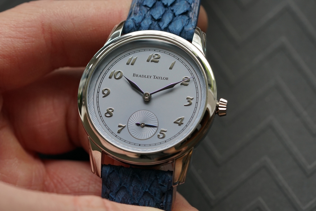
A few weeks after the decision to close the business, I met with Bradley to go on a socially-distanced walk with his dog, Romy. Before our walk he said that he was moving to Vancouver. Instead of being sad for having a friend move across the continent, I got excited, for the beautiful landscapes of British Columbia are something that all of us in Ontario admire from afar. He then showed me three prototypes of his new watch, the Paragon. Before we get into the interview with Bradley Taylor, I will go over my impressions of these watches.


The Paragon

First Impressions

As Mr. Taylor showed me the three prototypes for his new watch, a certain song started quietly resonating in my mind. As a professionally trained classical musician, Johann Sebastian Bach’s Chaconne/Ciaccona, Partita for Violin No. 2 started slowly blaring louder in my head as I handled the watches. At first I did not recognise the significance of this until later that evening, after settling into my reading chair from being on the road for many hours. The watch shared many characteristics and features with one of the greatest written works of all time – regardless of genre or application. An exhausting performance and accomplishment for any performer to play in a mediocre manner, this composition offers the very best of the Baroque era. This masterwork of classical music shared many of its features with the new Paragon from Bradley Taylor, these being a focus on precise detail that leaves nothing to chance, and vividly contrasting elements, tones, textures, and ambiance.

From the very first interaction, this watch impresses. The crown invites winding with a beautiful shape. Here is where the watch’s first surprise awaits its prospective owner. This dress watch has a screw-down crown, boasting a water resistance of 120m. This excited me personally for this watch has more than enough water resistance for most non-technical dives. The engagement of the crown and winding action leaves no room for distasteful wiggles or unrefined grating sounds. 


The Movement

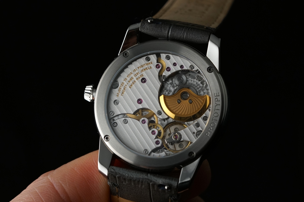
Viewed through the exhibition caseback, the excellent Vaucher 5401/32 provides a stunning view. This hand-finished movement puts other machine-finished movements from contemporary mass-market brands to shame. There is a reason why this movement alone costs thousands of dollars. This 30-millimetre movement has 160 parts, 29 jewels, and uses four gold blocks in its variable inertia balance resulting in a 49-hour power reserve at 21,600 beats per hour. All of this is made even more impressive when realising that the movement is only 2.6 millimetres thick. This movement is used by many other independent watchmakers who occupy this space, but also by larger brands whether it be the independents from Japan’s Kikuchi Nakagawa, Benjamin Chee Haute Horlogerie, to larger brands such as Hermés and of course Parmigiani Fleurier which owns Vaucher Manufacture Fleurier.

The 5400 series of movements see duty in various watches. The most affordable option housing this movement is the Slim D’Hermés, but this movement is used as the basis for independent watchmakers to showcase their strengths in case, dial, and hand design such as the aforementioned Nakagawa, the now closed Birchall & Taylor, to Bradley Taylor himself. Every level of this movement sings with its own voice, as if they are different movements in a carefully composed Baroque musical composition. The plates mirror their function in strength with strong bold Geneva stripes that invite one to look deeper into the movement. The staggeringly detailed 22-karat gold rotor foreshadows elements on the front of the dial, but we are getting ahead of ourselves. The contrasting finishing of all the gears is punctuated by the perlage background that directs one’s eyes onto the gold balance wheel, the second to fourth wheels, and the customised micro-rotor. The hand polishing on the edges of the plates demands your attention in a manner that is simply not present on less expensive offerings on the market. When one knows what they are looking at, there is not doubt that they are getting their monies worth here. This is just one of many examples of the attention to detail apparent as you turn the watch over and are greeted with the dial.


The Dial

For sourcing his dial, Mr. Taylor went to Swiss dial manufacturer Comblémine based in Saint-Sulpice. Many know this company who recently won The Men’s Watch Prize at the Grand Prix D’Horlgerie De Genéve with their 28SC, because of the dials in its owner’s watches, Kari Voutilainen. 

Working from its borders inwards, the same pattern on the micro-rotor outlines the dial and is in the small-seconds sub-dial. These raised sections add depth to the watch, and are greeted with the painstakingly hand-finished numerals designed by  Canadian typographer Ian Brignell.

The hands of this watch are what stood out to me. This makes sense when you find out that it takes Mr. Taylor around 20 hours to finish each hand himself. The gothic design makes this timepiece slightly nefarious in character. I could easily see this watch being worn by a supervillain in a movie. Personally, I have never encountered such a hand design with what seems to look like a blend of a leaf and a lance hand, and the tip of a teardrop hand. This timepiece has its own character altogether making this watch truly unique. This unique character and the concentration toward every possible consideration is highlighted with the tip of the minute hand gently pointing downward towards the minute track. We shall learn from Mr. Taylor himself as to what made him design such hands.

With these raised, engraved, hand-finished and engraved elements, the function of this dial is executed perfectly as it entices your gaze toward its act of time-telling. Bringing one’s attention toward the dial is accomplished by the hand-finished case.


The Case and Its Elements

It has been said by many enthusiasts and collectors that steel is the most precious metal in watches for it stands the test of time the best when compared to white gold. If one is planning on wearing one’s watches frequently and leads a non-sedentary life, steel is desirable for it can resist incoming impacts and be polished effectively if needed. The 316L stainless steel case is expertly hand-finished. When finished and polished to these levels, the case starts to have a certain glow. It reflects light back to one’s eye in a carefully choreographed manner. The bevelled lugs act in unison with the aforementioned elements in training the eye towards the dial. 

A unique feature which has nothing to do with the watch’s ability to tell time or that of legibility are the bespoke screws fastening the exhibition display caseback. For those of you who have not yet had the pleasure of meeting Mr. Taylor in person, this should give you a window in to what kind of human he is. It was not uncommon for people who were visiting the Birchall and Taylor workshop to see Mr. Taylor take a break for a few minutes. Instead of going for a walk or checking his phone while on his break, he would shift his focus towards inventing new items unrelated to watchmaking. I will not say what these items were, but this act of refreshing his state of mind before heading back to work speaks volumes as to the brain behind such a watch. The screw is probably the smallest square-headed screw in use to date. The design of this screw came from Canadian inventor Peter Lymburner Robertson. We shall hear from Mr. Taylor himself as to why he chose the Robertson Drive screw and its strengths in the interview portion. And yes, each screw is hand-finished by Mr. Taylor himself. This is the level of labour one should expect in such a watch.


Pricing and Availability

The Paragon is being sold for $22,000 USD which is in line with its competitors. These competitors offer haute horologerie levels of workmanship and detail in every facet of watchmaking. The one point which makes me personally sad is that the Paragon will be limited to 12 pieces. Due to being a single-person operation, Mr. Taylor can only produce so many watches himself. Those who collect watches and who are not strangers to spending this much on a watch may see this as a positive. As someone who has come to know Mr. Taylor on a personal level, I would like to see as many of his creations out in the world as possible, which brings me to my final point before the interview.

Most people question the existence of luxury watches. These people are only capable of questioning what is within their capacity of understanding and accumulated experiences which have shaped their opinions. I have heard some people question the point of a $800 Tissot Visodate. I have had others question as to why I would spend so much money on my Omega Speedmaster. I have seen many people who have become accustomed to purchasing watches under $10,000 frequently dispute the worth of watches such as those by F.P. Journe, A, Lange und Söhne, and even Patek Phillipe. These doubts are amplified when presented with a brand that they have not read about in their much-frequented online watch blogs and publications. 

What distinguishes varying levels of price ranges in the field of horology is not based simply on features. We are trained since childhood to hold up a product’s worth based on its features and surface levels of refinement. The level of workmanship for high-end watchmaking is similar to that of cars. The hours needed to finish each part of Mr. Taylor’s watch are not apparent to the untrained eye when viewing a compressed photograph on a screen. For someone who is unfamiliar with cars, seeing an all-black interior of a new $600,000 Rolls Royce Phantom would look no different to the interior of an all-black $40,000 Mercedes A Class in terms of refinement. It is only when consumers are educated in this field, see the watch with their own eyes, and operate it with their own hands that they can then fully appreciate the level of painstaking work that goes into each watch.


Knowing this, we will start our interview with Mr. Taylor with a harsh question, simply because we can.

The Interview

Furry Wrist Abroad (FWA)

Bradley Taylor (BT)

FWA: So before we dive into the pleasantries, I want to ask you why, but more importantly what. Why have you decided to design such a watch, and what in the world drives you, a single-person operation, to produce such a refined timepiece? Are you trying to make the rest of us look bad?

BT: Well that’s very kind of you. I can’t escape the allure of watchmaking. Making watches, like any other craft, requires practice and commitment and I am grateful my most recent work has been received so well.

FWA: Alright, with that out of the way, how is Vancouver treating you and has the move been a difficult one for your personal workshop?

BT: I am really enjoying Vancouver so far. It’s tough during the pandemic to create roots here but the area has so much to offer. The workshop has transformed from 2000 square feet to 80, so it’s required a lot of reorganizing, but I have managed to fit everything and can use my equipment with a more modular approach.

FWA: Every songwriter, author, and designer draws inspiration from other great works and in some cases relatively unknown achievements from the past. When initially designing the Paragon, were there any watches or pieces of design such as architecture which inspired you to give birth to such a unique watch?

BT: Of what I can consciously recall, themes of gothic architecture and storms managed to imprint themselves on the Paragon. The opposite-direction guilloché on the dial takes inspiration from a whirlpool.

FWA: The Paragon’s character is something which immediately made an impression on me. As you recall, while sitting in the lobby of your old condo in Toronto I mentioned that I could easily see a scene featuring the Paragon in my mind. This was one of a movie villain every day waking up, and gazing upon his vast collection of high-end watches, and selecting the Paragon every single day before he moved on to his wardrobe. The watch’s hands partially had something to do with this. But the unexpected tough and sturdy nature of the watch with its 120-metre water resistance could be felt when handling the watch. Before we get into the specific design aspects of the watch, what made you decide to make the Paragon go almost anywhere the human body could before risking decompression sickness?

BT: I got tired of worrying about my watch when I went away for a weekend or might be near water. I challenged myself and my casemaker to build the case for the Paragon to offer a much higher water resistance while preserving the appearance of an elegant watch. The screw-down crown provides an extra layer of security, and makes the sloped crown a pleasure to operate.

FWA: The merits of the Vaucher movement are well-known, but that of the dial manufacturer Comblémine may be a little less known to our readers. Their work speaks for itself when one looks at their long list of dials that were made for other brands. One such example is the intricate dials that they made for Sarpaneva. What about your design lead you to this specific company?

BT: It’s important to note that Kari Voutilainen purchased Comblémine in 2014. For anyone not familiar with the quality of Kari’s work, I would highly recommend taking a few minutes to acquaint yourself with it. There is a reason many important names work with his dial-making company, including MB&F, Grönefeld, Fiona Kruger and others – they operate with the same pride in their work as their customers do. When you work with them you can be confident your vision will be executed to a high level.

FWA: I mentioned the hands as a primary design feature which your watch utilises. What drew you to such a design? Furthermore, help our readers understand the process in making these hands. This not only being the hand finishing required, but the level of work required in producing the various colours of the hands on offer.

BT: It is quite rare to see purple tempered hands on a watch; the purple colour is much more challenging to execute than blue, as you are provided a very limited amount of time to remove the component from the heat while it oxidizes. Often each hand will have to be retempered multiple times, being polished each time in between to make a new attempt at achieving uniform colour.

FWA: Besides the logo, the typeface used for the hour indicators are the only other pieces of writing on the dial. Many can be forgiven for thinking that they are Breguet numerals, but if one actually pays attention, they will then realise that they are nothing alike. What was the collaboration process like with Mr. Brignell, and how did you two land on this typeface?

BT: I had started designing my own typeface; thankfully after going in circles for a few hours I recognized I would not be able to meet my own standards. Fate and a Google search led me to Ian Brignell, an incredibly accomplished Canadian typographer who has created an identity for so many brands, one of my favourites being the logo for Paramount pictures. Ian was excited by my project and spent time in the workshop learning and studying watch dials before creating the numeral set featured on the Paragon. Ian also created the wordmark for my name on the dial.

FWA: Like the numerals on the watch, you decided to use a Canadian design for the screws on the Paragon, the Robertson Drive screw head. What strengths does such a screw head provide and why did you scrupulously decide to hand-finish each screw in such a laborious fashion?

BT: I’ve always taken pride in the fact that most common screws in Canada are square drive, invented by a Canadian. It didn’t come as an immediate idea until I considered more ways to integrate Canadian elements into my work. The square head is challenging to manufacture but provides far more security than the typical flat head used, it is much harder to slip out of. Like all elements on the watch, the caseback screwheads receive the same attention and hand finishing.

FWA: The watch is available in either a black, pale blue, or purple dial. Each one has its own specific character; the black being very formal and timeless, and the pale blue being the watch that I have obsessively deemed as sinister. Which dial colour came first and speaks to you the most? 

BT: Pale blue, although I conceived the watch originally with a black dial, I really enjoy the difference in character when the dial or hands are made in different colours.

FWA: If a potential client were to come to you with a different colour in mind, first is this possible, and second which other dial variants did you consider that may not only work for the Paragon, but offer a distinct character from the rest of the colour options?

BT: Absolutely, many of my clients so far have chosen to have a custom dial colour for their Paragon. Salmon, or gold was a choice for my first round of prototyping – although I didn’t have the most recent design made in salmon, it looks excellent. I’m excited to see some of the new colours materialize as I begin to work on the series.

FWA: Lastly, looking at your work, it is obvious that you are a watchmaker for life and that the Paragon is only the start for your new self-titled watch company. Given this timepiece’s distinct and unmistakable personality, where do you see your work leading you in the near future?

BT: I have already begun some discussions with a collector about creating something special once I finish work on the Paragon series. For now I am looking forward to focusing on the Paragon.

FWA: Thank you once again for yet another probing interview, and as lovers of horology, we at The Matick Blog truly wish to see your work on many more wrists in the future in the decades to come. Some people may not know this, but you are not even 30 years old yet. This bodes very well for the field of independent watchmaking in our opinion.

BT: It was a pleasure, as always – thank you for giving me the opportunity to speak about my work.

For Team Matick,

FWA


Note –

Marshall: We at The Matick Blog would like to take this opportunity to profusely thank FWA for deciding to once again, let us run this amazing in-depth interview of Mr. Taylor on our humble little domain.

For more info, check out FWA’s work here and Mr Taylor’s latest creation <a href=”http://<!– wp:paragraph –> <p>https://www.bradleytaylor.ca/paragon</p> <!– /wp:paragraph –>” data-type=”URL” data-id=”<!– wp:paragraph –> <p>https://www.bradleytaylor.ca/paragon</p> here.

#TimeWellSpent – A Virtual Afternoon with Omega Watches – Novelties 2021

Introduction

Omega has finally unveiled their novelties for 2021, and we at Team Matick had the privilege of being present for the virtual launch. As there are already a number of in-depth articles detailing the exact specifications of the watches in question, we’ll instead be sharing some of our thoughts on these new watches, as well as answering some specific questions that you may have.

Oh, for those of you who are too lazy to read and prefer to listen to this episode (just kidding), check us out here @ The KC & Jon Jon Show:


Seamaster

First up in the line of new releases, we have the Omega Seamaster 300. First released in 1957, the latest generation is thinner than the last-gen model, thanks to the new domed sapphire glass and reworked case geometry. It also has a new movement, with the Calibre 8912 Master Chronometer movement (previously found on the Omega PloProf) beating within.

The watch contains plenty of vintage cues, from its clean sandwich dial inspired by early Seamaster 300 models in the 1960s, to its lollipop seconds hand. All the superfluous dial text has now been moved to the caseback, a good move in our book. As for case size, the watch remains at 41mm, although it may now have more presence on the wrist, with the dial opening increasing to 30.4mm from 29.5mm. On the other hand, the new angled, thinner case and bracelet with female end-links will probably help this watch be significantly more wearable for those with smaller wrists. We hope to go hands-on soon enough, and we’ll be sure to bring you an update!

While there has been a move towards ceramic bezel inserts across the industry as a whole, Omega has opted to use an aluminium one instead for its latest Seamasters, albeit one that is fully lumed. When we spoke to Jean-Claude Monachon, VP of Product/Customer Service and Product Development at Omega, he cited aesthetics as the primary reason for this choice, citing aluminium’s more vintage look. They were also only able to achieve a similar pantone to the dial via the use of aluminium, in order to achieve a pleasing, uniform appearance. 

To assuage concerns regarding reliability and durability, Gregory Kissling, Omega’s Head of Product Management, informed us that there is an oxalic anodised coating on the aluminium that has a hardness of approximately 500 Vickers. This offers a scratch resistance similar to that of LiquidMetal technology used on other Omega models.

The flagship model of the range here is obviously the Bronze Gold Model Seamaster 300. In case it isn’t obvious from the name, this particular Seamaster 300 is fully cased in Omega’s proprietary patent-pending alloy that was inspired by ancient Greece’s Corinthian Bronze. Its composition of copper, gold, silver, palladium, and gallium, creates a soft pink hue that sits between the brand’s 18K Moonshine gold and 18K Sedna gold.

Aside from the prerequisite copper (50%), the main ingredient in any bronze alloy, gold (37.5%) is added to bolster corrosion resistance and the specific amount used is to allow it to be hallmarked as 9K gold. The remaining 17.5% contains a secret blend of silver, palladium, and gallium, which provides colouration, shine, and promotes a more controlled patination process. This particular alloy offers bronze’s corrosion resistance without the scourge of verdigris formation (the greenish corrosion residue usually found on bronze), while still allowing for the formation of an even and mild patina over time. Omega has promised us that this material will age slowly and retain its vibrant shade, while developing a natural and beautiful patina over a longer period of time.

The dial, on the other hand, is made from an aging process with regular bronze, tropicalised to a deeper shade of brown before being coated with a sealant. This coating, along with the fact that the dial will be hermetically sealed within the 300m water-resistant case means that the dial will remain untarnished. Gregory also stated that the desired colour of the dial was impossible to achieve with Bronze Gold due to its chemical stability.

TL;DR

  • Available in black, blue and Bronze Gold variants;
  • Brand new Bronze Gold alloy, offering vibrant hues with slow, controlled patination;
  • More vintage aesthetics, with less dial text and a lollipop seconds hand;
  • New Master Chronometer movements;
  • Fully lumed bezel, but now in strengthened aluminium instead of ceramic; and
  • New, more wearable case dimensions, and female end-links for the bracelet.

Aqua Terra / Constellation

Next, Omega focuses on the discerning female collector with the Constellation Small Seconds and Seamaster Aqua Terra. Firstly, both watches will now have Master Chronometer movements by METAS (Federal Institute of Metrology), with the Calibre 8800 powering the Aqua Terra, and Calibre 8802/8803 powering the Constellation. Both ranges measure in at 34mm, both feature colourful dials, and are available mostly in precious metals, although the Aqua Terra will also be available in a two-tone combination of stainless steel and 18K Sedna gold.

Coming with a new array of textured dials in various striking colours and bejewelled bezels and hour markers, there’s something for everyone here in this new collection.

TL;DR

  • 34mm dials across the board.
  • Vibrant hues and textured dials.
  • New Master Chronometer movements.
  • Mostly precious metal cases with bejewelled bezels and dials.

Trésor

Omega’s deeply underrated dress series has now been revamped, with 2 new variants of the simple and elegant dress watch. The flagship model now has a small seconds at 6 o’clock that is balanced by, for the first time, a power reserve display at 12 o’clock. Powered by the brand new Calibre 8934 Master Chronometer, it is a manual winding movement with 72 hours of power reserve. Coming in a 40mm diameter case, it measures only 10mm thick inclusive of the box sapphire crystal, despite co-axial movements usually being significantly thicker than other more traditional movements.

According to Jean-Claude and Gregory, this was achieved by building the Calibre 8934 from the ground up with an integrated power reserve complication. Unlike other movements that use a module to integrate a complication to an existing architecture, this integration allows for the movement to be significantly thinner. It was also at this point that Gregory mentioned that the Calibre 8900 movement had sufficiently high torque to be a “tractor” movement; an interesting tidbit that we hope to revisit in the future!

The other new model in the Tresor line comes without the power reserve complication but maintains the small seconds display, via the also new Calibre 8926 Master Chronometer. With just the petite secondes at 6 o’clock, it retains a more traditional dress watch aesthetic. One model with a deep, shimmering blue dial was a real standout to us here at Team Matick, and we hope to bring you more pictures of that soon.

TL;DR

  • Brand new movements with small seconds and power reserve complication;
  • 10mm thick, inclusive of box sapphire crystal; and
  • Available in precious metal and stainless steel cases.

Seamaster 300M Black Black

In the vein of the Dark Side of the Moon (“DSOTM”) (and, partially, the Planet Ocean Deep Black), Omega has now launched an all-new addition to the Seamaster Diver 300M line, the Black Black. True to its name, this new variant comes entirely blacked out: the case, crown, helium release valve, bezel, insert, and dial are all made from black zirconium dioxide (ZrO2) ceramic, along with PVD blackened hands, anthracite black Super-LumiNova, and a black rubber strap with black ceramic clasp. Omega was not messing around when they named this the Black Black, something our own Vincent discovered when he asked the question, to which Jean-Claude simply answered: because everything is black, literally.

In order to achieve some semblance of visibility and visual interest, the watch blends a serious contrasting mix of finishes; brushed and polished segments of the case, polished hands to stand out against the matte wave dial, and a textured, laser-ablated finish on the bezel insert. We believe they may have achieved this, based on the quick look we managed to get via the online presentation with Gregory, but we’ll reserve judgement for when we manage to meet this watch in the metal (or ceramic, as it were).

TL;DR

  • New blacked out Seamaster, in the style of DSOTM;
  • Fully ceramic external components;
  • Various finishes throughout to improve visibility; and
  • Nekton-style textured bezel insert.

Moonwatch Velcro Straps

In the most interesting launch of the year, at least for our resident Moonwatch fanboy KC, Omega has listened to their fans and launched a series of NASA-style Velcro straps. We say NASA-style, as they are not quite the same as the original straps used by the astronauts during space missions. Using a two piece construction rather than the pass-through design of the original, the new strap sacrifices security against springbar failure for a more comfortable fit, with less material underneath the watch.

These new straps will be available in 3 colourways at launch: a standard black version most reminiscent of the original, a white version that serves as a callback to the Alaska Project, and a silver version that harkens to the pre-Moon Project Mercury era and their pioneering silver spacesuits. All versions of the strap will come with the classic NASA “meatball” logo, a nod that Speedmaster lovers are sure to appreciate.

As our in-house Speedy fanatic has the wrist circumference of a toothpick, he was concerned about the sizing of these new straps. However, Jean-Claude was kind enough to reassure him that while the initial launch will only come in a “regular” size, short and extra long sizes will also be released to ensure that all enthusiasts will be able to find an appropriate fit.

TL;DR

  • Two piece NASA-style velcro straps;
  • Available in black, white and silver;
  • Comes with the classic NASA “meatball” logo; and
  • Three sizes will eventually be available.


Conclusion

In line with Omega president Raynald Aeschlimann’s vision of streamlining the entire collection, the focus of the new releases was evolutionary rather than revolutionary, consisting of upgrades to existing models, rather than introducing brand new ones. These upgrades include new materials, new Master Chronometer-certified movements, and subtle design tweaks inspired by Omega’s vast archives. Omega is also moving towards having Master Chronometer-certified movements powering every watch, which is a testament to the quality and standard of excellence that Omega strives for.

For Team Matick,

KC, Jon

#LookCloser – A Week On The Wrist: Bell & Ross BR05 Chrono in Blue Steel

Vincent

In 2019, Bell & Ross (“B&R”) introduced the world to their first ever integrated sports watch with the three-hander BR 05. Now in late 2020, the BR05 Chrono was subsequently introduced as a follow up of the original BR05 in the form of a chronograph variant. Marshall and I were lucky enough to have met up before the implementation of the Movement Control Order 2.0 (“MCO”) with our dear friend Tong, who is the General Manager for B&R Asia and he graciously loaned us his BR05 Chrono for an article opportunity.

The conversation of luxury sports watch design with integrated bracelets had always been a highly debated topic over the past decade, and one that I personally find very intriguing. With B&R’s participation in this particular market segment, I found that the introduction of the BR05 line-up has added value and an extra considerable option for prospective customers and enthusiasts alike for a modern sporty do-it-all watch. During our conversation with Tong, he noted that the BR05 Chrono was B&R’s attempt to penetrate the market with a more commercial objective in mind. It is essentially a watch that is specifically built for the urban go-getter, in other words – for everyday wear. I’m not planning to dive too deep into the details because all the specifications and details of the BR05 Chrono can be found here for your reference. 

Dial and case: 

In my humble opinion, B&R has been throwing punches with the introduction of this BR05 Chrono, why do I say this? You may ask. Well, this is largely due to the fact that the BR05 line-up has been realized in a slightly larger 42mm form factor, coupled with a symmetrical and very well-balanced dial design. In comparison to the three-hander BR05, I think everyone here at Team Matick can come to an agreement that the dial of the BR05 Chrono is well-populated with the appropriate amount of details. It’s not overbearing, neither being too minimal. Just right.

But wait. 42mm, isn’t that still quite large by today’s standards? Again, you may ask. Well, hear me out, even with watches that usually would be a stretch to wear at 42mm for half of the wrists out there, thanks to the BR05s steeply-angled lugs and integrated bracelet, I thought it provides a lot of accommodation with skinny wrists out there like mine at less than 6 inches. This is definitely out of the norm for the most part especially for skinny Asian wrists, especially myself. While we are currently witnessing a trend for many brands to opt of smaller case sizes in recent watch releases, B&R really did this one a great amount of justice even though with a size bump with the case. Well played.

Another aspect I really appreciate with the BR05 Chrono is that B&R did not forget its signature case design which helped shape their brand identity today. As you can see here, the BR05 Chrono comes in the form of its signature square case along with a touch of an aviation-inspired dial with the largely applied numerals on 12 and 6 o’clock. The sub-dials on top of the sun-burst blue steel dial just speaks to me. I think almost anyone, whether you are a watch enthusiast or not, can appreciate a nicely designed sports watch with a simple, detailed and yet well-balanced chronograph sports watch.

As for the hour and minute hands, B&R used minimalistic baton-styled, applied polished indices, this gives the watch a nice tinge of simplicity and greatly enhances its legibility. As marketed as a watch for urban go-getters, B&R did not forget the inclusion of a date window just in case you get lost in time and day working overtime at your desk job (lol jk), which is positioned at the 4:30 position. With a round aperture and a blue-coloured date wheel that matches the dial perfectly – an aspect many brands tend to overlook which can make or break a dial’s symmetry in my opinion.

If there’s one thing that I would give kudos to, is that the chronograph pushers are well-integrated too. It doesn’t stick out like a sore thumb like almost half of the chronograph pushers out there (I’m looking at you, AP and Grand Seiko). Instead, it embraces the curve and edges of the case design really well, with multiple case steps that make the watch look rather complex in an integrated form factor.

The pusher action is overall, decent. It doesn’t stick out like a sore thumb like almost half of the chronograph pushers out there (ahem, AP and Grand Seiko). Though I must point out that, the pushers on this watch may be a little too stiff for some to get the chronograph running, I’m totally fine with it as it is, but I can only hope that this is a calculated safety mechanism to account for any occurrences of accidental activation. Overall, I think the overall design embraces the curves and edges of the case design really well, with multi-layered case steps that lends the watch some depth in an integrated form factor. Good stuff.

Bracelet:

Before going into the conversation revolving around integrated bracelets, I understand that many would, one way or another, relate this watch to the two of the “firsts”, or rather Gerald Genta’s integrated sports watch designs, i.e. the Audemars Piguet Royal Oak and the Patek Phillipe Nautilus, due to their respective integrated bracelets. The integrated bracelet design dates back to the 1970s industrial design language, right when the Swiss watch industry was facing the quartz revolution and desperately in need of a disruptive product, which, I guess eventually turned out to be in the form of stainless-steel integrated sports watch. With the huge success of the two “firsts” that has opened up a brand new market segment, it also has solidified its position in the market as a point of inspiration where, to put it simply, many people took references off from. Just like how we talk about similarities between a lot of skin divers out there with slim and flat watch cases and straight long lugs (ugh, ew), the usual comparisons drawn on the similarities of industrial design on these integrated bracelets used on sports watches are inevitable, to say the least.

Really captivating under ample of light.

The integrated bracelet on the BR05 Chrono comes with brushed surfaces and mirror-polished center-links, as it should be, to invoke a perception of luxury (i.e. how a product shines and plays with light on most luxury goods). It also has good tapered dimensions which is meant to shave off some of that bulkiness and a butterfly clasp with an “&” logo on it. There’s an option with the rubber strap with the BR05 Chrono, but I’m all for the looks of the bracelet, as it is better looking when paired with the BR05 Chrono in my humble opinion. I have worn this continuously for an entire week and I can confirm that the tapered design of the bracelet greatly contributes to the comfort, as it should be. There’s no point in wearing an uncomfortable watch when you’re paying at the full retail price of approximately MYR 28,500, am I right? (Foreshadowing this, more to come later.)

Movement:

Housed inside the BR05 Chrono is a BR-CAL.301 calibre, which essentially is a modified ETA calibre 2894-2 with 42 hours of power reserve, and a frequency of 28,800 vibrations per hour. Nothing really much to shout about really, though I really enjoyed the exhibition caseback with the customized rotor in full view. The crown is also at the right size, which is sufficiently sized to handle, but nimble enough to not to stick out like a sore thumb.

Although I personally would appreciate it if it housed an in-house calibre, but because with B&R’s own proprietary design language that’s generally with costs associated, it’s still an A-okay for me.

Price:

Currently, the BR05 Chrono in blue steel dial is priced at approximately MYR 28,500 – still quite steep I know, but hear me out – considering some of the strong contenders in the price range, the BR05 Chrono has some high expectations to meet, especially with the price tag it bears. Personally, I think B&R certainly delivered with an emphasis of an integrated design, that is well thought-out and executed. Although, I get the feeling that many might look elsewhere, but with what the watch offers in dimensions, quality, and design; having experienced all of the above during my time spent with it on my wrist, I personally feel that the price tag can be justified.

Final thoughts:

Overall, as I have mentioned in the above, the BR05 Chrono is a well-designed watch in many aspects, but most importantly, it is a design that carries the B&R DNA so very well. I personally think that B&R has done a tremendous job in taking its original rugged design DNA and translating it into something very wearable for modern standards by many urban city people. My only gripe with the watch is the integrated bracelet which restricts convenient strap changes. I call this an iNteGRaTed Pr0bLeM (Pun totally intended by the way).

Anyway, there we have it, this is my take on the B&R BR05 Chrono: A great, no-nonsense, luxury all-rounder. In my mind, the BR05 Chrono is one of those watches where you have to put it on your wrist in order to pass judgment. In other words, this is a watch you should not overlook if you are looking for something that has a modern, sporty, daily-wearing and urban appeal. Therefore, I highly recommend you check it out at B&R boutiques after the MCO 2.0 period.

Quoting a Malay idiom: “Belum try, belum tau. Sudah try, hari-hari mau.”

(You won’t know it unless you tried it. And until you had tried it, you would come back for more.)

Finally, if you like it as much as I do, then just Buy la.

For Team Matick
Vincen
t