#LookCloser – A Conversation With Birchall & Taylor (Part 3)

To finish off –

Part 3: The Reference 1

FurryWristAbroad (FWA):

Birchall & Taylor’s workshop is unique in Toronto and quite possibly in Canada. There are some watchmakers, and other small independent brands which have small workshops, but none are like this that I know of. Like some watchmakers in Switzerland and abroad, those curious about watchmaking can take a tour and see firsthand what goes into making these watches. I highly recommend that you take this tour. You will not only be treated to seeing the tools of the trade necessary for high horology such as lathes capable of micrometer levels of precision and kilns, but you will see firsthand the difference between a mass-production watch such as a Rolex, and something from the likes of Birchall & Taylor.

When seeing a watch that is as elegant and simple as the Reference 1 in pictures, it is easy for most to see a simple watch. This is even the case for some horology enthusiasts who look upon a picture of the front of the watch and somehow claim that the watch is powered by a regular off-the-shelf movement. This is why this interview had to be done. 

When speaking to a few collectors about the Reference 1, they all mentioned that they would consider getting a watch such as the Omega Trésor which is priced similarly as the Reference 1. After having handled a Trésor and the Reference 1 many times, it is obvious that people need to see and hold the Reference 1 in person.

The level of polishing on the Reference 1 is simply astounding and absolutely obliterates the polishing and level of detail presented by the previously mentioned Omega and that of similarly priced Rolexes. The 316L stainless steel case has the quality of a precious metal when finished by hand on this level. Unlike metals such as gold, this watch will easily put up with more punishment before needing to be polished. The first time I held the Reference 1, I could not put into words why it felt as special as it did. That was until I remembered my impressions of when I held and wore a F.P. Journe Chronometre Bleu. 

_DSF1862

This is further reinforced with the Reference 1-R and its upgraded hands and dial. I returned a couple of months after the initial interview to get some photographs of the new model and you can see for yourself that all of Brad and Charles’ work was definitely worth it. The hand finished hands add a level of richness that continues to delight the wearer, or the photographer in this case, as light continually plays with them throughout the course of the day. This addition did not occur over night. Months of hard work ensuring the utmost quality were accomplished to make this happen. The new dial is something that simply generates smiles because of its beauty. The Reference 1-R seems to have a new and more direct focus with the more detailed dial. The more detailed sub-seconds gives it a newly found and unexpected presence. The watch now has a presence very much like a professional athlete wearing a classic and perfectly tailored suit. There is a strength, purpose, and a constitution to achieve at such a high level that is simply not possible for most people.

The attention to detail of the polishing and overall finishing of the case was the leading contributor to the comparison being made. The enamel dial has a depth, warmth, and a constantly changing character that though very different from the Chronometre Bleu, incites a similar level of joy when gazing upon it. This is helped by the blackened hands which themselves have a dynamic personality and offer a wonderful legibility while being wholly endearing. All of this is substantiated when surveying the exhibition caseback and the micro-rotor by Vaucher at work. 

_DSF1878

The example that I got to wear and look at that day was Charles’ very own Reference 1. He has worn this specific example for over a year and he is a very active person. The strap, buckle, case, and overall finishing all looked exemplary. This illustrated to me the difference in the case finishing in such a watch when compared to offerings from Nomos, Omega, and other watches in my collection.

After the interview was over and I left, I was filled with a sense of pure joy. Naturally I was stuck in Toronto’s notorious traffic and I did not mind in the slightest. Over the last couple of years, my passion and love for horology started to suffer greatly. This was due to seeing my own watches mechanically fail in unexpected ways, experiencing poor service (while also experiencing amazing service as well from various brands such as Swatch Group Canada), and most importantly the closed-mindedness of a lot of enthusiasts who frequent horology events. Getting to hold and wear a watch such as the Reference 1 made me fall head over heels in love with horology once again. It reminded me why these wonderful mechanical works of art are truly special.

On-wrist, the Reference 1 has a glow that might be missed when looking at it in photographs. The case finishing reflects light perfectly and without any imperfections. When a timepiece such as this is finished to this level, its character is amplified when it reflects light. I have found this to be the case with certain cars whose aerodynamics comes to life as one walks around the car. These purposefully formed lines reveal the true intent of the vehicle when it is performing at its peak. The same is with the Reference 1. Whereas the sports car is exerting its dominance over physics, the Reference 1 is revealing its excellence and the many hundreds of hours that go into making one. The 1-R simply does all of this but better and with a new focus that is simply spellbinding. 

W3

That glow I mentioned earlier is only magnified by the grand feu enamel dial which somehow comes to life and has a very organic presence. To simply say that it looks wet would be to oversimplify this dial. The perfect printing and the beautifully crafted hands also have a large part to play in the watch seemingly being alive on wrist. The counter of the small seconds hand, which is an open circle, not only balances the top of the dial which has the logo, but it creates a tension. This tension arises from a sense of the seconds hand stalking time itself in a manner that is truly captivating. On their website there is a small video on the Reference 1 page which shows a rotating Reference 1 in action. Here you can start to get a glimpse of this character that this timepiece reveals. The strap and buckle hug your wrists with a level of comfort that results in the watch disappearing. The perfectly sculpted case also allows for optimal wearing.

_DSF1862

In the weeks following the interview, I have found myself buying and reading many books on horology, its development, history, recent noteworthy watchmakers, and the engineering and design behind various movements. I have also started wearing my Nomos Orion 1989 more often. This is obviously because it is my closest watch to the Reference 1, in that it embodies the design elements of a great dress watch – a 38mm case, elegant and clean yet legible dial, and a beautifully decorated manual-wind movement.

I had gone into this interview with the goal of helping the masses and enthusiasts better understand the level of work that goes into a watch such as the Reference 1. I am not certain whether or not this will be the end result of this article. What I am certain of, however, is that my love for this field has been rekindled, and I am very thankful to both Brad and Charles for this.

P7

Marshall: A big thank you to FWA for doing this in-depth interview with the good folks of Birchall & Taylor. We hope the rest of Team Matick will someday have the honour of visiting the studio as well.

For more details on the Reference 1-R, click here.

Apologies for the slight delay for part 3 but we hope that you’ve enjoyed this interview! More to come in the near future!

For Team Matick,

Furry Wrist Abroad

#LookCloser – A Conversation With Birchall & Taylor (Part 2)

Reintroduction

FurryWristAbroad (FWA):

As we paused for pastries from the first half of the interview, we further settled into the discussion about their daily operations and their first watch, the Reference 1. We briefly also went over their new upcoming model the Reference 1-R and their goals with the watch. At the time only a prototype was available and it was really impressive. The depth of the dial and how the sub-seconds at 6 o’clock steps away from from the rest of the dial adds a dimension to the watch that I had not seen within this price range. The beautifully ventilated workshop hummed with soft classical music as we indulged in some sweets before returning to the questions. Workplaces of many variants all try to achieve a welcoming aura in hopes of making the employees and visitors feel at home. While we finished the box of pastries, I realised just how well thought out this space was, and how comfortable it was. As one enters, you are welcomed by a small meeting area with a couch, coffee table, and two chairs. To your left as you enter there is a bookshelf lined with books on the industry. Just above it is a small liquor shelf with their trillium corporate logo hanging on top.

With such a welcoming and well thought out space, this instantly led me to the first question as to their day-to-day operations, and that was of health hazards which arise from years of being a watchmaker.


Part 2: Operations and the Reference One

S10

FWA: It does not take too much of an elaborate imagination to realise that there are hazards to your occupations. These being repetitive strain injuries that others such as dentists suffer from being hunched over their tasks and having to perform very delicate and precise actions. Did they cover this at watchmaking school and how does it affect your daily grind?

Brad Taylor: Proper bench height is very important and it was discussed immediately in school — having your bench at your shoulders, having your torso and your back upright. At the end of the day you will see most watchmakers, unfortunately, do not have the best posture, for a lot of it has to do with the benches. All of our benches have armrests, which are really important for comfort and circulation when one is spending a lot of hours at the bench. Charles and I are both pretty tall and the height is really important as well. Our benches are around 43 inches (1.1m) from the ground.

FWA: Being a two-man operation, both of you must share in a lot of the tasks and duties that go into a watch. Since you have known and worked with each other for so long, is your workflow regarding the watchmaking pretty streamlined? Or do you two occasionally mix things up so that each of you essentially get a hand on everything that goes into not only putting your watches together but also doing the final quality assurance?

Brad: Production-wise we both do everything. So, Charles can take a watch from the materials that we receive into a completed watch, and so can I. At the end of the day, if either one of us is away for the week, the other can work without waiting for someone else to complete an operation. We do prefer different tasks and split things up as orders come in. There are so many different things to do when you’re making a watch. Whether it be finishing, cutting parts for the new hands, assembly, and regulation, we’re never stuck doing the same thing every day or week.

Charles Birchall: And if we were not at the same level when it comes to production, there would be constant roadblocks.

DSCF9700

FWA: What has been the most recent example of a great shared moment while in the workshop, and one while either at a trade show or when meeting enthusiasts?

Brad: Finishing and then selling our first watch was a moment I’ll never forget. Completing our first hand-finished hand was incredible as well, very few watch companies put so much emphasis on their hands. Being published on Hodinkee was incredible for us. We were in contact with Stephen Pulvirent and we sent a watch down to New York so they could check it out in person. It was a great feeling since we’ve been reading Hodinkee together in watchmaking school.

Charles: Making our first set of hand-finished hands took months, it was amazing to see it come together. Being in Hodinkee was one of the dreams for us and to have it happen so soon was surreal. 

S7

FWA: When speaking to other independent watchmakers and some microbrands, their biggest challenge is communicating their designs to their foreign suppliers, and then the challenge of quality assurance. Since Birchall & Taylor work with mostly Swiss companies, what is the biggest challenge in having such a large part of your business relying on those who reside in Switzerland?

Brad: I would say that we haven’t had issues because we are very particular about what we want, and we work with the best companies in the world. Challenges could arise when you do not work with the best. We design everything ourselves and our own technical drawings. We send off the exact part we need in a 3D file, and it almost always comes to us in the exact specs we designed, or we discuss any changes required and run a second batch. We also do not outsource any aspects which we believe shouldn’t be. We finish our cases ourselves because I do not think we could trust anyone to finish our cases to our quality and standards. The quality of our polished and brushed surfaces are as good as we believe that you can get even though we are still always trying to improve. I don’t think we could trust that with anyone unless they were in our workshop.

Charles: I think you’re right; I’ve never given it much thought but we could never outsource our polishing. It would result in a lot of back-and-forths.

Brad: This also means that if one of our clients scratches their watch, we can polish it and have it back to them in a reasonable amount of time. We also do all our warranty work here, for instance, if there is a mechanical issue. I think it’s unacceptable how many larger brands insist on watches being sent back to Switzerland for servicing and waiting often many months if you have purchased a high-end watch. We are also open to working with qualified watchmakers local to our clients around the globe.

DSCF9779

FWA: You have said in the past that you had set out to make the essential dress watch in terms of design and size. Can you walk us through what lead you toward the Reference 1? Whether that being sleepless nights of design work, inspirations taken from those who came before you?

Brad: I brought a dial design to Charles when we were starting the company that was very classical, understated and would look great on enamel. He liked it and we started talking. We’ve always had a sort of checklist that we never actually talked about in watchmaking school that was inspired by some of the best such as Philippe Dufour. We got to tour his workshop when we were just starting school, which was an incredibly inspirational experience. That checklist for us was for a 3 hand dress watch with a 38mm case, a light-coloured enamel dial, and a hand-wound or micro-rotor movement. Not a full rotor, for it obscures the finishing of the movement.

Charles: In terms of inspiration and the form of the watch, a few dress watches we liked from the 1950s provided some case design ideas.

FWA: What made you decide to go with the grand feu dial, and what drew you to working with Donzé Cadrans for the dial? Were there other options that you considered that still seem like a viable choice for future watches?

Brad: Enamel for us is such a deep and rich material. The colour is not something that you can match with anything. Also, the fact that it does not fade is important. We would love for our clients to hand down their watches in 50 years, and they will look just as good as the day they bought them. That would be ideal, not like the manufacturing faults that are so prized for some very collected brands in the vintage aftermarket. Also, the back shows the exposé of the incredible feat of precision mechanics and engineering, while on the front you have an enamel dial which was baked in a kiln at 800 degrees celsius. 70% of them are destroyed due to imperfections such as tiny cracks or bubbles, but if they are made properly, they will never fade. It’s almost a contrast of one side having an artisanal process of making the dial, and on the other, you have some of the most demanding precise mechanical work, with hand-finished precise bevels.

Charles: A lot of people think that watchmaking is a dying art, but watchmakers know that enameling is truly a dying art, and there are only a few houses making it, even fewer that are doing it to the level of Donzé. What goes into it, the time that it takes, it’s exciting as watchmakers to see something so painstaking happen as well.

Brad: When we last met with Donzé it immediately felt right. The quality of what they are producing is fantastic.

DSCF9704

FWA: There is no denying that the Vaucher movement used in your watches is absolutely stunning and that it is a great movement. Even people who consider themselves to be well-read on horology and are enthusiasts do not know this about the Vaucher movement. What attracted you to this movement?

Brad: It utilises a micro-rotor and it is ultra-thin at 2.7mm thick. The 48-hour power reserve, it’s hand-finished, it has radial Côtes de Genéve from the balance… I think even most discerning collectors have trouble complaining about this movement (laughs).
There is the notion of in-house, but we are not at the point where we can make our own movement. We hope to one day. In the meantime, we will continue to work with one of the best watch manufacturers in the world.

Charles: The finishing on the movement is also very well executed. It was important for us to visit them in Fleurier and see it for ourselves.

Brad: We usually have to purchase a handful of movements from them at a time. We managed to purchase just one under the condition that we wanted to inspect it. So we purchased it from them, drove back to our old school’s workshop, disassembled it immediately, took it all apart, and we were really happy with it. Everything was built really well. It does everything that we could ask for and it’s been revised over the years as any movement should be. When making an in-house movement lots of testing needs to be done, and often many revisions are required to produce an efficiently running movement.

Charles: We wouldn’t have gone through with it if they didn’t let us do that. We really had to see for ourselves the quality.

S1

FWA: Many are firm believers that when it comes to watches, steel is the most precious metal due to practical standards. Have you received any requests to make watches in other metals, and do you see B&T offering different case materials in the future?

Brad: I think steel made sense because of the cost. It is really expensive starting a watch company. We are just two watchmakers; we are not two businesspeople who got together and decided to launch into this. From a material perspective, it really is a fantastic material. It is much more scratch-resistant than gold or other precious metals. It has a good weight to it, and it has a really nice colour when it is properly polished.
It is likely that in the future that we will make watches with precious metal cases.

FWA: Lastly, any plans on making a high-accuracy robust quartz dive watch?

(The room is filled with chuckles as my hopes for such a watch made by these two gentlemen fades.)

___

TBC.

In Part 3 we will go over the workshop and the Reference 1 and the new Reference 1-R.

#LookCloser – A Conversation with Birchall & Taylor (Part 1)

Introduction

FurryWristAbroad (FWA):

The field of horology and watches is vast and complicated. This leads to oversimplifications, confusion, and generalisations. In many cases it results in just not caring enough to learn about more obscure and smaller independent watch brands. There are the most common consumers who are looking for a watch that simply works, or those who view them as a fashion accessory. Then there are those who spend a considerable amount on a watch, who purchase a timepiece as a status symbol, or who wish to commemorate a milestone. Lastly there are those who are enthusiasts who have an in-depth view and knowledge about the industry, yet even with their extensive comprehension and grasp of the field, this group has shown an unexpected level of unawareness and cognitive indolence when it comes to smaller and independent brands. 

It was when speaking with a large group of horology enthusiasts that I decided to conduct this interview with Toronto-based independent watchmakers Birchall & Taylor. For a group that spends a lot of its spare time scouring the Internet for information on the field, I was shocked to hear some either discount the brand, falsely claim that the watch was assembled with cheaper parts than it clearly was not, or severely undervalue their work and their first watch, the Reference 1.

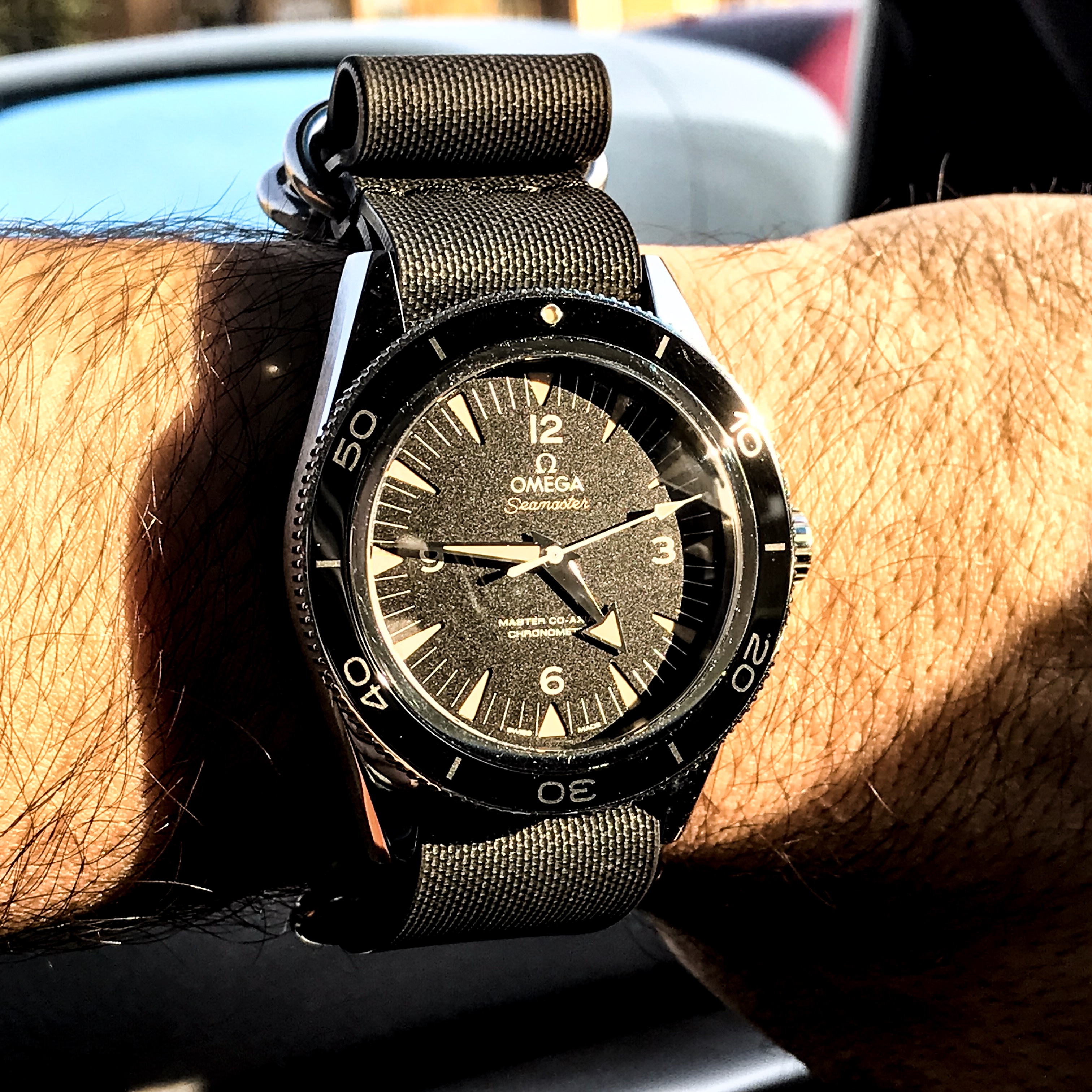
As their second model is about to be released, on a beautiful afternoon in May, I made my way over to Birchall & Taylor’s exquisite workshop, and we went over what made them get into watchmaking, and all the work that goes in to their watch. Their new watch is called the Reference 1-R. The R stands for “revised” and it incorporates many new features such as a more in-depth dial and hand finished hands.

(PSA) This is not a brief interview that you can skim through while waiting for an appointment, and as a result it will be in three parts. First we will go into the background of the watchmakers, then we will go a little further into their operations and their watch, and lastly we will look at the Reference 1 itself and the wonderful workshop in which Birchall & Taylor call their home.

*all pictures taken by FWA.

DSCF9810-1

Part 1: The Background & History Behind the Watchmakers 

FWA: What are your earliest memories of when you knew that you liked watches, and that you took an interest in timepieces?

Charles Birchall: I inherited my grandfather’s Longines. The Longines had the misfortune of being the first watch I ever opened, I spent about 8 hours hunched over it, that was when I knew that this was something that I wanted to pursue. Despite the experience I wish I would have taken apart a less important watch.

FWA: Have you ever considered restoring that watch?

Charles: If I can find all the parts I will.

FWA: How about you, Brad? (chuckles)

Brad Taylor: You should restore that watch! I got into watchmaking when I took apart a Seiko Monster. It blew my mind seeing the movement, something so small, so intricate, it was something I found really beautiful. I dabbled in being a watch enthusiast by frequenting forums like Watchuseek. That’s actually where I made a thread where I asked about watchmaking schools, which led to me going to Switzerland for a bench test.. 

FWA: What watch do you wear on a daily basis and which watch has the most meaning to you?

Brad:  Most days I wear our Reference 1, another favourite is a vintage Zenith, time only, which has the first directly driven central seconds hand movement inside. It’s the 133.8 which is a bumper automatic. I restored it during my time at watchmaking school from two donor watches from eBay – it has a lot of sentimental value.

Charles: When I’m not wearing the Reference 1, I wear something quite different. It’s something that I bought which is quite light-hearted. It’s a 1999 Air King, but a Domino’s Pizza edition. At the 6 o’clock you have the Domino’s logo quite prominently displayed. Originally I thought it was funny and tongue-in-cheek, but I love the design. It’s very simple.

_DSF1866-1

FWA: What was the first moment like when the two of you met at the Korpela and Hofs Watchmaking School? Was there an immediate sense of relief to have another Canadian there? Or did it spawn any healthy competitiveness amongst you two?

Brad: There was really not any competition between us. It was nice to have someone from a similar cultural background, especially when you’re living in the middle of a tiny town and you don’t speak the local language.

FWA: May you give us an example of what a really hard exam was like at watchmaking school?

Brad: One of the first exams is making a brass puzzle piece, which ideally fits into another puzzle piece. The tolerances on that key were 5/100ths of a millimetre. All filed by hand. We had eight hours, and you have just barely enough time to make one or two, and we had to hand in our best set. Later in that term of micro-mechanics we did balance staff turning (cutting material off a spinning part with a sharp graver), which may be one of the most challenging facets of watchmaking.

Charles: Yeah, extremely difficult. You’re turning to the highest level of precision, and it’s something that in its entire length is just a few millimeters. The pivots on either end have to be accurate to a few microns (1/1000ths of a millimeter). Just about everything in the balance staff is a challenge.

Brad: The finishing of the balance staff has to be at a very high level. It’s really challenging and rewarding.

P6

FWA: Brad, you had mentioned before that you always enjoyed taking things apart and being mechanically inclined as a child. Did either of your parents or any of your other family members share your interests, and how did they nurture your need to explore how things worked?

Brad: That’s an interesting question; my father’s really handy, but not professionally.  He’s a golf instructor, and my mother works in policy development. Both of my grandfathers were engineers, and I suspect that’s where a lot of my inclination came from. Ever since I was young whatever my parents would buy for me would be disassembled in pieces on the floor moments later, I would spend all my time in the garage building things, mostly out of wood, and sometimes out of concrete where I would pour random concrete blocks. It was a mess. I would solder, I would make potato cannons. All kinds of fun stuff like that, but the idea of playing with metal always seemed like a dream. The ability to manipulate this material that is so hard, and so challenging to work with.

FWA: Charles, for you growing up, did you have any influences nurturing your mechanical interests?

Charles: Not from my parents, it’s never something that they were inclined towards, the same with my siblings, although my grandfather was an engineer at General Dynamics in Quebec. So we have that lineage again; it skipped a generation, it seems. My parents were very encouraging and very patient, and that’s as much as you can ask for. Like Brad, I came upon watchmaking as an aspiration to work with metal.

FWA: Charles, you have a massively interesting background in which you grew up abroad and were exposed to many different hobbies and aspects of life. As a child and when you were younger, were there any other interests that sparked your desire to become a watchmaker? Or did you know right away at a certain age?

Charles: When I was a kid living in the Bahamas, my neighbour and I would frequent the hardware store and make all sorts of things from random parts. We would make little boats that we would attempt to sail in the ocean, and once we made a little box car to go down hills with. That evolved into working on bicycles and computers. In terms of something being directly related to watchmaking, there was nothing near as challenging like that.

W5

FWA: For both of you, what was your favourite or weirdest random job on your way toward becoming a watchmaker?

Brad: I had a variety of jobs growing up. My parents made sure I was working since I was 16. That would either have been at a garden or grocery store. Then I ended up doing some graphic design, to doing co-op at a garage working on cars. I have also done demolition and construction. I did not have a job that I fell in love with before watchmaking. I have always made an effort to explore anything which I might just have a sliver of interest in. That’s when watchmaking came together by taking apart that Seiko. It all made sense then. Ever since that day I have been living and breathing watchmaking. I’ll be here in the workshop all day, then I’ll go home and watch videos or listen to a podcast on watches or watchmaking. Then before I go to bed, I’ll hop on Instagram and all I am looking at are watches. The hunger and passion has not died down even one percent in all this time. It’s only gotten stronger.

Charles: I worked for a contractor here in Toronto, and through that I really got experience seeing a job through to fruition, and seeing a project through to the end. Lots of jobs from building decks to putting up drywall, or small renovations. It was addicting to see and build a project and see it through to the end. This included all the different aspects from getting the parts, to dropping things off at the dump. That job really got me thinking about pursuing a career in which im working with my hands.  

FWA: What do you guys miss the most from your days in Switzerland? (student life/cuisine/the environment/the people etc.)

Brad: I would have to say the chocolate buns (chuckles all around), or pain au chocolat. So in the morning, there was this very cheery Swiss lady, who would welcome you with a very loud and incredible “Bonjour!” and wake you right up. It was some of the best pastry I ever had in my life. So on the way to school in the morning, I made it a habit.

Charles: For me it was the little weekend trips, and just being in the middle of Europe. You could get in the car, get on the train and be somewhere completely exotic and out of a picture book in no time.

Brad: Being in the middle of the industry was really nice as well. Being able to drive ten minutes to go to a specific tool shop, you can’t exactly do that in Toronto.

FWA: You have to build the tool shop yourself?

Brad: Basically yes. A lot of the machines are there in Switzerland. The reason why we wanted to do this in Toronto was because we really like Toronto, and we think we can pull it off here. It is however a lot easier to open up a workshop in Switzerland where the machines, partners and knowledge are domestic.

FWA: Watchmaking school is not the run-of-the-mill or average answer a teenager gives a guidance counsellor when asked what he would like to study. What were the reactions of your parents and your friends? 

Brad: I was in school for marketing and business administration, which obviously came into use given our current situation. I also had no idea what I wanted to do when I finished high school. Part way through college is when I took apart that Seiko and was like “Oh no!” (everyone in the room breaks down into laughter). I kind of decided after drinking at a house party in Waterloo at my friends’, and I said “I’m going to go to watchmaking school,” and I am a man of my word. I did my best to find out where to go, did my bench test at our school and got accepted. My parents were a bit confused. They didn’t understand how I would get a job when I returned. It was a relief for everyone when I came as I had a few companies competing for me.

Charles: I was halfway through my political science degree, and I had gone for the bench test in Switzerland. I got back and I was given the offer to attend, I told my guidance counsellor, and she (like many others) responded by asking, “Oh, is that still a thing?”. Once they learned about it and how rare it is, just like my parents, they were then turned on to it.
But it’s funny, I had never heard from Brad about him deciding to go into watchmaking when he was drinking, because that is when I made the decision as well. (Laughs) I was at a party, and I met this Swiss woman whose brother was in the watch industry. I was talking about it and she said “Yeah, I should definitely do it.” (More laughs)

FWA: That was after a lot of deliberating and learning a bit more, but it was still in the infancy of learning about watchmaking. So it’s really funny to hear that from Brad.

Brad: That we both declared it when we were drunk.

Charles: I also do not go back on things that I promise when I am drunk either.

Brad: Nope. (More laughs)

Charles: …To this day!

FWA: Advice for young people wanting to get into watchmaking? And exploring all other career options does not count.

Brad: Learn as much as you can about watchmaking before you step into the wormhole. We have had a handful of visits to the workshop by people who were thinking about it and wanted to get a better idea of what’s involved.. It’s great to be able to provide that experience to someone close by. Watchmaking schools are very expensive. At the same time, if it is something that you are very compelled to do, then you are going to do it. You have to love it. If you do not love it, there are much easier ways to make a living. But if you love it, there is no better way to make a living than watchmaking.

Charles: Really sate your curiosity first and try to open up a watch and work on it, or buy as many books as you can…

Brad: … Not your grandfather’s Longines

Charles: Learn everything that you can, for you have to be committed. You are learning something that is so specific and you cannot apply the knowledge elsewhere afterwards, and there’s not necessarily a related plan B if you’re all in. 

Brad: I’ll add to that. There are jobs for people who want to be a watchmaker. If you want to be a watchmaker, you should not have trouble finding a job. The average age of a watchmaker is now around 60 in North America. If you are interested in it, there will be demand.

DSCF9840

FWA: If you had the chance to clear up one major misconception about not only being a watchmaker, but an independent watchmaking brand, what would that be?

Brad: As a general watchmaker, the amount of work that goes into a regular service is often misunderstood by the public. Some of the watches that I have seen come in at my old job had been so abused – all in an effort to save a few hundred dollars by the owner. The cost to restore the damage is often very high as well, and sometimes impossible on what may be a sentimental watch. Like other small watch companies some may assume that because we source many of our components that our watch is not as good as a much larger, in-house brand’s watch. The watch industry has been sharing intelligence, machinery and components since it began, many of the most illustrious brands source specific components from companies we work with. The watch industry has historically never focused so much on everything being done in one location, in fact this leads to lower quality and less specialization. At the end of the day it is about the quality, it’s there or it isn’t.

Charles: Many do not know about the level of effort and time that goes into our polishing and the production of the Reference 1. As Brad said we source some components, but nothing leaves our workshop without passing through our hands. Just the watch case takes us 10-12 hours to polish, including at least 2 hours of finishing in between the lugs, creating a horizontal grain only possible by hand – or welded lugs.

FWA: Overall I have observed that a lot of watch enthusiasts look at the watch and because it is a relatively elegant design, they mistake it for something simple. In reality, hundreds of hours go into such a watch in terms of polishing and putting them together in such a highly cultivated and graceful manner. In many ways, someone looking at your watch and underestimating its brilliance underscores just how much of a superlative design and execution this Reference 1 is. 

FWA: What has been your favourite moment in the industry since you got involved with it? Whether this is a technological advancement in watches or watchmaking? Or something else that you feel has made an impact for the betterment of the industry?

Charles: The rise of brands outside of Switzerland, small or otherwise. People like us who have taken the initiative to pursue watchmaking in their hometown and where they are from. 

_DSF1878

FWA: What’s your favourite and least favourite aspect of doing trade shows abroad? How are Canadians generally received in the industry?

Brad: I think for a lot of people seeing Canadians in the industry can be a bit confusing. Canada has a brand of maple syrup and beavers and we are doing something quite a bit different. At the end of the day it’s about the watch, not it’s location. The notion of ‘location based manufacturing’ can be confusing, even ‘Swiss Made’ — many of the watches in Switzerland are made by the French, noted by the traffic jams that would occur daily in our old town near the border. We gladly invite comparisons of our watches against the best in the industry, no matter the location. When they look at the watch they then start to understand what we are about. At trade shows my favourite thing is hearing opinions from those who have never heard of the company or seen our watch in person. My least favourite thing is standing the entire day and often missing lunch as things get so busy. It’s very tiring but it’s only for a few days in a row and entirely worth it.      

FWA: The two of you like to mingle with the enthusiast community and it shows. Within this community, what was your favourite moment?

Charles: A fellow RedBar member and I bonded on an author we both like –an author who speaks a lot about watches, and works watches into his work. It was one of his books that inspired me to start collecting watches and further learn about watchmaking. The author is William Gibson, and the book is called Virtual Light. 

Brad: It’s just been nice overall to spend time with people who share your interests, incidentally many of us share a lot of similar obsessions: cars, whisky, cigars etc. When we make something new it’s also great to get in-person feedback. It’s very motivating when people are excited about what we’re doing, especially after working for many weeks in the workshop beforehand.

___

TBC.

In Part 2 we will go deeper into the daily operations of a modern independent watchmaking workshop and how it works. 

#LookCloser – Wear Report – Seiko Alpinist SARB017

Vincent

As the relatively new owner of a Seiko SARB017 ‘Alpinist’, I thought I would take some time to share my thoughts on this nice little piece with our loyal readers of The Matick Blog.

Introduction:

The existence of the Alpinist model first came into my knowledge when I witnessed a video on Youtube, of a man who had a strange hybrid American-British accent, professing his sheer adoration for the humble Seiko model.

After what felt like an ages-long period of consideration and anticipation, a “check out” button was hit and in March 2019, a fine specimen of the Seiko Alpinist was flown in from the land of the rising sun to the land down under.

The Seiko ref. SARB017, more fondly known as the Alpinist, was since then finally made mine.

Why the Alpinist, you ask? Well, I’m the sort of person who likes watches with the ability to start conversations that go a little like this:

“Oh, nice watch!”

“Oh yes thank you! It’s my favourite piece… yadeeyadeeyada” 

The Alpinist was simply the obvious choice, and in my experience, has made for the best conversations over coffee and over sales at work. I have owned the Alpinist for almost six months now, and the sheer adoration I felt when I first laid eyes upon it in the YouTube video I was talking about earlier hasn’t waned at all. Not one bit.

The Alpinist, Explorer from the East

A11

Many of us watch lovers will consider Seiko watches to be sort of a starting point for our collecting journeys, no doubt thanks to the watchmaker’s heritage and the outstanding value for money their watches represent. I am no exception—I haven’t stopped since my first Seiko 5 and can’t see myself jumping off the Seiko hype train any time soon!

The Alpinist should no doubt be familiar ground for many of our readers. As for those who may not know, the Alpinist was conceived in 1961 to serve the needs of Japanese mountaineers and explorers, more specifically, to navigate through the deepest of Japanese forests—only much later on did they begin to become perceived as collectors’ and enthusiasts’ watches. Equipped with a compendium of rugged specifications which we will delve into shortly, the Alpinist has certainly lived up to its name, and in doing so, become one of the most collectable sports watches out there.

Case, dial and everything at first glance

The Alpinist’s case sits particularly well on the wrist at 38 millimetres across and 46 millimetres from lug to lug, and manages to please most wrist sizes out there including my tiny 14.5 centimetres (<6 inches).

The Alpinist sports two crowns: a threaded, signed crown at 3 o’clock for your usual time and date adjustments, along with a second crown at the 4 o’clock position for calibrating the compass found on the outer chapter ring. The 3 o’clock screw-down crown furnishes the Alpinist with an extra water resistance depth of up to 200 metres/20 atmospheres— figures which should, if anything, make the Alpinist an all-around reliable sports watch. 

A3

Turning over to the Alpinist’s presentation dial, you will find yellow gold indices around the chapter ring—triangular indices for the odd numbers (except at 3 o’clock) and Arabic numerals for the even numbers. All this is applied against a green canvas with a breathtaking sunburst effect. Tiny applied lume dots which correspond to the hour indices may also be found on the chapter ring.

A generous quantity of photoluminescent material is applied on all three hands. The elongated hour hand, in particular, appears to reflect a hybrid Mercedes-Cathedral style, while the minute hand is the ‘piston’ style. While the quality of the Alpinist’s lume is decent overall, I personally found it challenging to read time in absolute darkness due to the design of the hour lume dots, all of which are identical in size and proportion.

A4

Spanning the dial’s outermost circumference is the Alpinist’s compass feature, divided into printed cardinal and intercardinal directions. Rather than using it as it was perhaps intended, I found an interesting utility for the compass in the form of a timer for my late-night snacking indulgences (usually, none other than the famous Indomie Mi Goreng noodles).

With sufficient lighting, however, telling the time accurately using the Alpinist is an absolute breeze, thanks to the clearly printed chapter ring divisions.

The featured date window is well presented and comes at the right size. To my pleasant surprise, Seiko made the wise design choice of matching the date wheel’s colour to the dial. Though I personally prefer framed date windows on my watches, but hey, it looks really good this way too, so no complaints from me there.

A10

The Alpinist’s case back is nothing too fancy, as you would expect from a traditional sports watch. A substantial layer of stainless steel helps lock away the watch’s internals from moisture, and presumably adds to its water-resistance as well. As an ode to its mountaineering origins, the Alpinist does have a signed case back consisted of two alpines set at the centre, along with the usual ring of basic specifications. 

The Strap

It has been my experience that one of the ways in which Seiko is able to keep the prices of their watches low is by making compromises with their straps. This is a known testimony among collectors and watch buyers alike, whom are often disappointed by the quality of Seiko’s bracelets and straps. Much my disappointment, the Alpinist’s stock leather strap does Seiko no favours to dispel this unfortunate preconception.

A16

Being the past owner of several Seiko 5 models, I speak from first-hand experience when I say that I have been largely underwhelmed with all of Seiko’s straps and bracelets. This was, to me, not unreasonable as the Seiko 5s are after all made to a price point, and a budget one at that. Unfortunately, I had the same underwhelming impression of the Alpinist’s strap as I did of those Seiko 5 straps, which was made all the more disappointing, considering the Alpinist is a proper Japanese-made model which also happens to cost substantially more.

The 20 millimetres-wide leather strap quite frankly looked the part, but felt plasticky upon contact. It was also, in my opinion, excessively stiff, which made the strap feel like it would never break in nicely as would most other leather products. All of these annoyances make this supposedly genuine-leather strap score, for lack of a better term, a complete zero in my books. I personally opted for the Strapcode oyster bracelet and have never looked back since.

I’m not alone in thinking that the Alpinist’s stock strap simply isn’t ideal. Have a quick scroll through Instagram for posts about the SARB017 and you’ll see what I mean.

A8

The replacement bracelet, with its alternating brushed and polished surfaces, allows the Alpinist to look much more playful than it already is. It does so by giving it an abundance of visual appeal through the way it plays with lights.

Movement

Seconds hand
Sweeping seconds hand of the Alpinist.

The beating heart of the Alpinist comes in the form of Seiko’s in-house calibre 6R15. It beats at 21,600 vibrations per hour, and features hacking and manual winding for your daily syncing and winding indulgences.

I personally love hand-winding my watches. Doing so provides me with the opportunity and a reason to take a moment to gaze upon and admire them. And with the Alpinist being one of my favourite watches, these features were very much welcome.

There are no doubt other watches at a similar price point to that of the Alpinist, including those by micro brands such as the Nodus Avalon and the BOLDR Expedition, which feature movements with a higher number of vibrations per hour (such as the Miyota 9000 series or Selitta SW-200-1), presenting a smoother looking sweep on the seconds hand and is, admittedly, very aesthetically pleasing. Speaking from experience, it is a noticeable difference, and if these things matter to you, you would be looking at watches equipped with what are called ‘high-beat movements’.

As almost everyone knew what the Alpinist has and made of, let’s skip to what makes the whole part of the love-hate relationship that you will be reading today.

Everyday wear with the Alpinist

I spent a good 3 months in the honeymoon period with the Alpinist. I wore it to date nights, work, nights out with friends and sometimes even when I was just simply chilling around at home, though I don’t usually wear my watches at home (yes, I was that enamoured with it).

If it wasn’t already obvious enough, I truly enjoyed every moment of my time with the Alpinist around my wrist. And I still do. As I briefly alluded to earlier, part of the reason for my intense love of wearing the Alpinist is due to its hand-winding feature, which, for lack of a better description, compels me to bond with the watch and become acutely conscious of winding it up before I go on with my day. 

A14

I should probably also mention that the Alpinist wears very comfortably too, especially with the Strapcode bracelet, which hasn’t come off since the day it was put on. Despite the unconventional green dial, the Alpinist matches surprisingly easily with my wardrobe, as most of my clothes comprise neutral colours, i.e. black, white, grey, and the occasional dark blue as well. 

Though at 12-millimetres height, the Alpinist’s case may seem to veer slightly towards the taller end of things, it somehow still manages to sit comfortably and tuck easily under my jackets and long sleeves, particularly in comparison to my other watches like the Turtle (duh). I believe this is thanks to the rounded edge design of the Alpinist’s case.

This sort of wearability, naturally, makes me tend to pick the Alpinist over my other watches. That, along with the generally cold weather in Melbourne, which means that I would often have to put on my jacket and long sleeves when out and about.

Wrist Roll
Easy slide-out in a sunny Melbourne afternoon.

The 200 metres of water resistance that the Alpinist is rated for doesn’t disappoint at all, especially if you’re the kind of person who routinely walks around outdoors in Kuala Lumpur, or if you’re like me, living at a place known for having “4 seasons in a day”, e.g. Melbourne. 

Everlasting love for the Alpinist

I would consider the acquisition of my Alpinist to be my biggest achievement at this point in my life (besides nailing my Master’s degree, of course. Ehehehe). Some years ago, I would never have imagined the day that I would spend this much money on a seemingly simple wristwatch, yet, here I am today with my Alpinist.

Wearing the Alpinist has, since then, brought me nothing but joy. Pure joy. It’s not the same kind of joy I experienced when I unboxed my very first Seiko 5 (which, by the way, I purchased with allowance given to me by my parents, which then resulted in me having to live on nothing but 40 packs of Indomie for some months); it’s not the same kind of joy I experienced when I was gifted my TAG Heuer Formula 1 from my parents, and it’s definitely a different kind of joy than when I was gifted my Seiko Prospex SRP779 “Pepsi Turtle” for graduating from my MBA course.

What it is, is the joy of savouring the fruits of my persistence and hard work. It is the joy of feeling like I’d finally achieved a higher degree of financial freedom. Most importantly, however, it is the joy of having it sit comfortably on my left wrist and having it stare back at me—all those hard times that I’d gone through, reflecting right back at me through the Alpinist. My Alpinist.

A5

I fall in love all over again every time I pick up my Alpinist, give it a good wind, and slap it onto my wrist. So much so, that the absolute love I have for this piece has almost made me feel like I’ve betrayed my TAG, Turtle and other watches.

At the risk of sounding creepy and weird, this is a watch I would make love to. Not literally, of course. But really, it’s more the love of a well-designed and well-priced product. For me, the idea of a product that is packed with features and screams “value for money” is always welcome. And the Alpinist, is for me the watch that simply screams a whole lot of value, for my money. 

A big part of it, is the looks of others, collectors or otherwise, when they spot the Alpinist. Sure, the Alpinist certainly isn’t some million-dollar watch that would amaze nearly everyone in the world, nor is it a watch that has tons of ‘wow’ factors going for it. Yet, it also isn’t some merely ‘normal’ watch that you would see every day on almost 70% of people’s wrists on the tram, on the sidewalk, in a cafe or at work.

I still remember the time I got dissed by a customer who apparently worked as a representative of Patek Philippe. Well I mean, he is working for PP after all, so whatever. Nothing against PP, by the way. The only point I’m trying to make here is that the Alpinist makes it easy to strike up conversations with the people around me. Some compliment it, some despise it, and some certainly question it. It has this uncanny ability to spark conversations that go on for minutes, if not, hours. And it can certainly be a statement piece that lets people know: ‘ah, I sorta know what this whole game is about.’

For that (and everything else I’ve already said about the Alpinist), I love it.

Hating the Alpinist

Other than its strap, what hate?

Closing this off

Yes, I’m fully aware that this is a biased review. But I have a damned good reason for being biased, so why would you let that turn you off?

For under US$550, the amount of value the Alpinist offers versus its competitors is tremendous. From a reliable calibre to a nicely thought out design, the Alpinist could be one that will stay in your collection for a long time. Add that to the fact that it was discontinued last year, which may make it a sound investment option too.

Of course, I fully acknowledge that the Alpinist will not be everyone’s cup of tea. Some may think that the green makes it hard to pull off with their outfits, while for me, it works perfectly fine.

At this price point, the micro-brand space does have a considerable number of models that may suit a larger group of potential watch buyers, especially with the current trend that appears to be moving towards more vintage-inspired designs.

But for me, what the Alpinist brings to the table is a great design, great specifications and a great history behind the watch and its manufacturer.

A7

Hence, the verdict? If you’ve been looking at the Alpinist, I’d urge you to snag one while you still can. Light speed at that too, before we run out of available stock.

For Team Matick,

Vincent

#LookCloser – Spinnaker Bradner – Long Term Wear Report

Ken

Introduction

I’ve been wearing the Spinnaker Bradner SP-5057-02 for a good 6 months now, and this is what I have to say ..

Maybe they’re finally taking heed to what the style experts and the more conservative watch aficionados among us have been saying all along: Balance is key. And that to me can only be a good thing.

Every so often, a value-priced product comes along and completely shatters the concept of what one would ordinarily perceive to be achievable at a given price point. One such product is the brand new Bradner, a vintage-inspired diving watch by Spinnaker, a lesser-known, but no less worthy of your attention watchmaker. A brand inspired by the traditionally “manly” concepts of bravery, adventure, skill and ingenuity, Spinnaker designs and produces watches with a combination of features and pragmatic craftsmanship exceedingly rare at their price points.

Upon a brief skim-through of its product range, it shouldn’t take long for one to discover that most of Spinnaker’s designs have a sort of “aquatic” vibe to them, which makes sense really, considering the brand’s inspiration in the world of yachting. Whilst I can’t claim to be anywhere near knowledgeable about what I’m certain is an extremely challenging and equally exhilarating sport, it just so happens that this sort of aquatic-centric design is right up my alley. For reasons difficult to elucidate, there has always been something mysteriously fascinating about the depths of the oceans, and really, what makes the Bradner so special is that it unassumingly reflects many of those reasons so well.

IMG_5850-01.jpeg

Whilst words seem ever so inadequate to describe the functional beauty of this watch, should one choose to do so, one may designate the Bradner in no more than a handful of words. Yes, it’s a vintage-styled diving watch – that’s just four words isn’t it? Now, I can perfectly imagine the unaffected looks and sighs of boredom when people hear the words “vintage diver” – “oh no, here we go again, another Submariner clone/homage/lookalike”, and there’ll be some of you smart alecs who might go “ah, if not a Sub, it’s got to be a 50 Fathoms clone/homage/lookalike then.” If your train of thought was any permutation or combination of those words, then let me assure you, you have been completely and utterly mistaken. And really, fortunately so, because you’re definitely in for a ride with the Bradner.

As the venerable Mr. Mayer would say, “look closer” . And if you do, you’ll find that the Bradner is really not your run-of-the-mill vintage-style diver.

At the risk of coming across as trying too hard to build anticipation, shall we “dive” right into it then?

Okay, I’ll stop now.

The Bradner

The Spinnaker Bradner, though not based directly upon any one diving watch in particular, draws most of its design inspiration from the under-appreciated compressor diving watches of the late 1950s to the early 1970s. Instantly distinguishing features of such watches are the dual crowns and internal rotating bezel, which is in stark contrast to the “classic” diver design, namely that of a single crown and unidirectional external bezel.

The Bradner is also powered by a pretty standard workhorse Seiko NH35 24 Jewel Automatic movement featuring hacking capabilities and 41 hours of power reserve.

IMG_5890-01.jpeg

The Case

As a concession to modernity, the case is expectedly larger in diameter than the original watches upon which it is based. Whilst, at 42 millimetres, the Bradner sits right at home on the guys (and girls) with about-average 7-inch wrists, it still manages to not feel out of place on those of us with smaller wrists. I can only attribute this to the well-proportioned lugs which slope down rather dramatically. This gives the illusion of a watch smaller than its size would suggest, and also helps create a better fit too.

In stark contrast to the situation several years ago, it does appear that there has been a trend within the watch industry toward more modest and less jarring proportions, particularly among lesser-known microbrands. Maybe they’re finally taking heed to what the style experts and the more conservative watch aficionados among us have been saying all along: Balance is key. And that to me can only be a good thing.

In short, the Bradner wears well. Take it from the Asian man with 6.3-inch wrists and an aversion to anything above 40 millimetres.

The lugs and case are brushed throughout, no doubt reflecting the Bradner’s utilitarian origins whilst adding to its understated charm. There was also no sensation of excessive sharpness at the outer edges of the case lugs, which is another great feature I noticed about the Bradner, and something which many watches at a variety of price points are too often guilty of.

Though I am in no position to verify Spinnaker’s claim of fashioning the Bradner’s case out of “marine-grade” stainless steel, it does feel as solid as steel watches go, and I wouldn’t have any qualms or concerns regarding its long-term durability.

IMG_5822-01.jpeg

The dual crowns at the 2 and 4 o’clock positions may seem an unfamiliar feature to many, yet it’s one that is vintage-correct and pays tribute to the original inspiration behind the Bradner’s design. I thought it to be a well-considered feature which allows the Bradner to stand out just a little bit from the sea of watches with crowns at the 3 o’clock position. Save for the lack of characteristic cross-hatching marks, the Bradner’s crowns are very much faithful to the original design in terms of their execution, design and proportions. A signed Spinnaker “yacht sail” logo adds a nice flair to the otherwise plain surface of the 4 o’clock crown.

The Dial

Let me start by saying right off the bat that the Bradner’s dial is easily its most impressive aspect. Yet, because it in itself comprises so many elements which are impressive in their own right, I say this with a degree of reservation. On the other hand, I cannot help but think that this is only the case because all those elements work together to complement and balance each other out so well.

Viewed against the right lighting, the keen observer will notice a subtle sunburst effect which permeates the dial finish, another feature which gives away the fact that the Bradner is not a vintage piece. Though not strictly vintage-correct, the sunburst effect adds an interesting dimension to the otherwise plain black dial. I can imagine the dial developing a very charming ‘ghost’ colouration as it fades out due to repeated exposure to ultraviolet rays as the years go by.

The watch is rated to a depth of 500 feet, which once again differentiates it from the original compressor watches, which most commonly had a maximum rated depth of 600 feet. The notion of the Bradner being able to withstand less the equivalent of 100 feet of water pressure, compared with the original 600-feet rated compressors is one that is insignificant to me, considering that most of us who would purchase the Bradner would rarely ever step foot within 500 feet of a body of water that deep anyway.

The hour indices are appropriately sized squares and rectangles, another feature which makes the Bradner stand out from your common or garden diving watch. The brushed metal trim surrounding the indices pairs well with the brushed stainless-steel case and complements the understated flair of the Bradner.

Unsurprisingly, the inclusion of a date window is bound to bring controversy in any vintage-inspired design such as this. For fear of beating the “to have or not to have a date window” dead horse, it would be remiss of me not to mention that many of the original compressor diving watches on which the Bradner is based had in fact date windows as well. To my relief, it is executed subtly on the Bradner and does not detract from its overall design, and therefore doesn’t bother me much.

7Z1A0067-01.jpeg

The Bradner’s dial is rounded out with classic-looking baton hands, raised silver Spinnaker logo and perhaps most outstanding of all, an inner bezel which turns both clockwise and anticlockwise. The argument here is that because the bezel is located beneath the watch crystal itself and is turned via a crown rather than by hand, there is a much lower possibility of accidentally knocking it out of position, thus eliminating the necessity of making the bezel unidirectional, i.e. turning one way only.

The bezel turning action is smooth overall with some mild resistance, which makes sense really – making the turning action too easy would have rendered less effective the original purpose of a bezel on a diving watch, that is to indicate the length of time a diver had spent underwater.

As really should be the case with any diving watch, legibility on the Bradner is no less than outstanding. There is zero possibility of confusion between the hour and minute hands, and together with the indices, they visually pop against a dark background in the form of the black dial.

Viewed as a unified whole, and to describe it simply, the impression I am getting from the Bradner’s face is a strong sense of dimensionality and multi-layered-ness (I know that’s not a word, but you catch my drift). In addition to giving appeal to an otherwise relatively conservative design, the Bradner’s indices, hands, logo, minute marker ring and moulded inner bezel all add up to a watch captivating to gaze upon and admire.

The Strap

If you, like me, thought the strap which comes with the Bradner was your typical, poor-quality el cheapo leather band, you’d be forgiven for doing so, because quite frankly it does look the part when viewed at a glance. See it in person and feel it on your wrist however, and you’ll see what I mean when I say that this is a fantastic strap. Sure, it’s not as buttery soft as some leather straps go, but it’s made with a sturdiness belied by its appearance – it’s quite a bit thicker than what you’d normally expect for this style of strap, but still manages to be flexible enough to wrap around one’s wrist without issue.

The deep olive-green colour used on this particular colourway of the Bradner is a personal favourite of mine. It matches fantastically well with a variety of casual outfits, and being a customary colour of many military forces from all around the world, it does add a little bit of a ‘tough-guy’ swagger to the wearer as well.

Spinnaker claims that the strap is water-proof treated. I certainly couldn’t tell if this was the case just by looking at it or feeling it, but what I will say is that the strap has shown a remarkable resistance to absorbing grime and stains so far, despite me having worn the watch nearly every day for a number of weeks since I received it. Could this be the water-proof treatment coming into play? I can’t say for sure, but I absolutely wouldn’t be opposed to the idea if it helps keep the strap looking nice and smelling fresh.

Finally, the signed buckle adds a nice touch to the otherwise plain-looking strap. It also appears to be fabricated from the same metal used on the case, hands and indices, and is similarly brushed as well. To me, Spinnaker’s choice of keeping the finish consistent throughout is a sensible design choice which gives coherence to the entire look of the watch.

Lume

This article simply cannot be called a review of a diving watch without at least some mention of lume, can it?

I was very much impressed by the way the Bradner’s dial looked with the lume all charged up. The numerous geometric shapes and symmetrical lines of photoluminescent material kept things visually stimulating. For lack of a better description, it looked as if the watch had somehow awakened from its slumber and “come alive”.

Whilst, after a full charge, the Bradner’s lume makes telling the time in the dark a perfectly possible task, I did feel it had some ways to go in terms of what I feel should be the ideal brightness for maximum legibility of a watch dial under low lighting. And it certainly wasn’t due to an economic decision on Spinnaker’s part either, as the lume used on the Bradner is none other than the world-famous Super-LumiNova brand, used on watches costing many (I repeat, many) more times than the Bradner. Maybe it’s just that I’m so used to the lume on Seiko’s divers, which are renowned for their glaring shine and for being the brightest in the market.

Conclusion

I’ve truly fallen head over heels for this watch. Sure, there’s still a part of me which wishes that it was just a couple of millimetres smaller, yet I am certain it will likely be the Goldilocks “just right” for most.

Part of the reason for the substantial time taken for me to complete this review was because I wanted to commit to the Bradner completely over a period of time, and in doing so, become truly accustomed to the idea of wearing it as a primary piece, which is the kind of target consumer I’d imagine Spinnaker had in mind when designing the watch.

7Z1A0073-01.jpeg

My verdict? Yes, the Bradner is truly an outstanding watch for everyday wear. For a little less than $300, you can own a watch that is a truly legitimate timepiece and attention-grabbing head-turner (in a good way, of course), with a lot of design heritage to boot. And that’s not even factoring in the storewide discounts often advertised on Spinnaker’s website. For those of you who’ve always wanted a sip of the ‘Super Compressor’ Kool-Aid without all the worries which necessarily come with the acquisition of a vintage watch, the Bradner is a hard-to-beat proposition at its price point.

Check out their full range here.

For Team Matick,

Ken

#LookCloser – Omega Seamaster 300 Master Co-axial – Long Term Wear Report

Marshall

In my mind, @furrywristabroad has an interesting way with his words, today he is going to be talking about a watch he holds dear to his ‘wrist’ – the Omega Seamaster 300 Master Co-axial.

FYI, this is unlike any other regular watch review. In any case (no pun intended), I would describe it as an experience, and its definitely something you’d be seeing us do fairly often in the near foreseeable future. We sincerely hope you’ll like this new review style.

Now go grab your scotch, fire up your YouTube/Spotify, turn up the volume, sit back, relax, ‘cuz its time for another installment of #LookCloser.

Enjoy, guys.

The mission of this review is to inform those who plan on purchasing such a watch to gauge their expectations of these pieces of jewellery accordingly, for they are jewellery, and fragile tools at best by modern standards.

A Love Story:

Long-Term Review of the Omega Seamaster 300 Master Co-Axial Chronometer

The year was 2014. After being unveiled at the Baselworld show, I had set my sights on owning the newly announced Omega Seamaster 300 Master Co-Axial Chronometer. After reading a glowing review of the watch where the journalist took it into the water with him, I knew right then and there that I would be making the purchase the next time I  left my house.

What followed were four years of ownership that scaled from pure joy to unbridled disappointment. This review will go over what a real-world ownership experience is of such a product, and the very real relationships we develop with such inanimate objects. Watch reviews from traditional outlets do not do this for they are simply an extension of marketing department efforts by watch brands. Thus, such long-term reviews are not feasible. The mission of this review is to inform those who plan on purchasing such a watch to gauge their expectations of these pieces of jewellery accordingly, for they are jewellery, and fragile tools at best by modern standards.

15924FA1-E813-430C-B6CC-543D86069DBF

Simply doing so would not give this watch and my time with it justice, however. What you will read is a love story accompanied by a soundtrack. Hopefully by the end of this article, you will get a greater sense as to whether such a watch is right for you.


Soundtrack track 1: “The Nature of Inviting” by IAMX

The Introduction

This watch was purchased for the purposes of being worn daily and to be dived with on a weekly basis. Having worn an Omega Speedmaster Professional for several years, I had decided on buying a desirable dive watch to accompany me on my dives. I had originally planned on purchasing the Rolex Submariner but found the new larger case and the paragraph of text on the dial to be unflattering. There was also the factor of by wearing a Rolex, making oneself a target for theft and assault almost in every region on the planet. Thus, when this watch was announced at Baselworld, with all of its technological advancements, and its pleasing vintage styling, I had then decided on purchasing this watch as soon as it was available.

I will go over how this watch performed on a daily basis, what went well and what went wrong, and what challenges arose over the four years of ownership. I will then cover how this watch performed while diving, with the specific sets of obstacles that arose in this role and how they were resolved. Lastly, I will carefully describe the multiple servicing journeys the watch undertook. Thus, at the end I hope you can make a correct purchasing decision if you are looking for such a timepiece in this category.


Soundtrack track 2: “Paradise” by Sade

The Basics and How this Love Story Began

There is no denying that this is a beautiful watch. First there are the proportions of the watch which Omega executed perfectly. The case measures at a very modern 41mm and the lug width comes in around 21mm. In fact, they are closer to 20.5 mm and this is reduced for a reason. On one summer evening, an accomplished watchmaker and I were discussing watch design and he mentioned that an accepted ratio for the case to lug width design was that of 2:1. This is the case of this Seamaster 300, and it is beautifully proportioned as a result. I have heard many first-hand complaints about this lug width and even heard one person claim that it was the major factor in his decision to not buy the watch.

Second, the thickness of 15mm makes it fit easily with formalwear and to slip easily in and out of one’s buoyancy compensation device (BCD) before and after a dive. The 48mm lug-to-lug distance also means that it is wearable by many who even have wrist circumferences below 7 inches. The articulated bracelet with an adjustable clasp further aided wearability and promised capabilities of accompanying me on dives by being able to be worn over thinner exposure suits. Couple that with its great vintage looks and that mesmerising ceramic dial that seemingly changes every second while on wrist, and you have one of the most beautiful dive watches ever produced.

The dial is simply a masterpiece and a definite highlight of the watch. The sandblasted ceramic dial changes from black to a glistening grey with the slightest change in lighting conditions. The recessed hourly markers add a depth that is not overdone and adds an element of grace. The silver printing of the second markers, logo, and limited text are tastefully executed as well. The second markers truly do shine in low-light situations. The decision to not have an applied logo is one that reinforces the watch and its elegant design.

IMG_6731

The calibre 8400 Master Co-Axial movement also promised greater reliability, longer service intervals, and unrivalled anti-magnetism when compared to the offerings by Rolex such as their Milgauss. This movement is beautifully machine-decorated and a true joy to view. This is one of the great things which mechanically-inclined owners of modern Omegas get to enjoy.

Soundtrack track 3: “Jihad Joe” by Christian Atunde Adjuah:

Daily Duty on Land

The first couple years of ownership of this watch were spectacular. The polished surfaces on the case and bracelet gradually accumulated scratches and scuffs which only made it dearer to my eyes and it never became less attractive to onlookers. For the first year the movement was accurate to +2 seconds a day and in the second year it gradually rose to +4 seconds a day. The winding action  throughout had never felt nearly as smooth as other watches in the price range, and the luminescent markers always performed very poorly. They would essentially not be able to hold a charge through a two-hour period while in a movie theatre. This was and is something that my Omega Speedmaster Professional never had an issue with.

Within the first year though, the clasp mechanism (which has a spring keeping it closed) failed and the watch would occasionally come loose. On one comedic occasion I pointed at a friend’s open zipper on his jeans and the watch flew off my wrist and hit the person standing next to him. The very next day I went to Swatch Group headquarters in Toronto and they supplied a replacement clasp very quickly. So, I ordered some custom-made straps and wore my Speedmaster in the meantime while I waited for the replacement clasp. Amongst these straps were a custom rubber NATO made by Alex Moss of YellowDog Watchstraps. Little did I know that my watch would primarily reside on his straps.

Unexpectedly my love for this watch grew during this period for it gave me the opportunity to wear it on a varying number of straps. I had once thought that my Speedmaster was the most versatile watch for pairing with straps. I was mistaken. The vintage beige luminescent markers allowed the Seamaster 300 to adorn even more straps than the versatile Speedy. After getting a few curved spring bars, I fully switched to wearing the watch with NATO and pass-through straps.

IMG_3708

What resulted was truly the best thing that watch ownership could offer, a watch that accompanied me to every imaginable event. From formal events to impromptu long-distance sprints home in the rain, to dinners with loved ones, and to seeing the same loved ones lose their lives,  this watch became more than just a tool or a piece of jewellery. It became a part of my suit of armour that I wore on a daily basis as I headed out into the world to aggressively attack all of the challenges it threw my way.

As my love affair with this watch seemed to reach heights I had never thought possible, I soon realised that troubled times were ahead.

Soundtrack track 4: “Tell Everybody” by Róisin Murphy:

What Went Wrong

As the third year of owning the Omega Seamaster 300 went into full swing, I was fully in love with the watch. I had gone on a couple of memorable dives with it, it had accompanied me on many milestones, and it was a stable companion, until it was not.

I had noticed that the watch was not only gaining more time every day, but it was doing so at alarmingly different rates. One day it would gain 7 seconds a day. The next day it would gain 15 seconds. Then the following day it would gain 9 seconds. I had recently become a lot more active, but I primarily wore a G-Shock alongside my Polar V800 during my sporting activities, so I was surprised at the change in performance.

As a result, during a beautiful snowstorm I decided to walk many kilometres to the authorised dealer where I had bought this watch for advice. Upon arriving, I was quickly advised to send it in for servicing. Heartbroken, I went out for an hour stroll and went back in to see my beloved daily companion get wrapped and sent off to the Swatch Group Headquarters.

After four months had passed, I finally received the phone call that my watch was ready. I raced to receive my watch and once again wore it lovingly and almost immediately went diving with it again. A few days later I noticed that there were many particles in the clear caseback, so I took a half day off and  went down to the Swatch Group headquarters and had them clean the watch. This only took about twenty minutes. After a couple of weeks, I started to notice something troubling. The ceramic bezel was disintegrating. With the help of many on Instagram, I had noticed that this was a problem that was happening to many other Omega Seamaster 300 Master Co-Axial Chronometers and to this day still come across examples that are suffering from this ailment to varying degrees.

As a result, I once again took another half day off and went down to the Swatch Group headquarters and explained to them the issue. At this point I had fallen out of love with the watch and had enough. Too many issues had arisen for a product of such perceived quality, and I simply wanted to move on. I had shown the bezel and pictures of other examples to the truly lovely, kind, and understanding employees at Swatch Group Canada, and they asked for me to leave the watch with them. I initially said that it was fine, and that I would essentially stop wearing the watch most days. Reassuring me that I would be taken care of, I left the watch in Swatch Group Canada’s capable hands and within a few days they informed me that they were sourcing a new bezel free of charge. This was of great relief to me. A new Liquid Metal ceramic bezel for this Omega costs around $900 CDN. With one of the selling features of the watch being that the ceramic bezel would not age and stay perfect for my lifetime, I was truly crushed at this point. Three weeks later the watch was once again back in my hands, and once again I took it immediately on its last dive. A couple of days later I once again found some dust and particles through the exhibition caseback. Taking yet another half day off, the matter was resolved in under a half hour and I was on my way after having another pleasant chat with the watchmaker who cleaned the inside of my watch.

By this time I had moved on to another watch and all the love I had felt towards this watch was replaced with disappointment. It was replaced with a tough professional quartz dive watch by Seiko, the MarineMaster SBBN025.

IMG_7012

I had later decided then to wear this watch to my best friend’s wedding. My reasoning for this was that the watch had lumed hands and indicators, so it was the most functional watch I could wear at a formal event. I had many best-man-related duties that required me to make announcements and arrangements at specific times throughout the evening, and the wedding was out in the country. Thus,  I needed nighttime legibility. I had forgotten how horrible the lume was on this watch and as night fell, I quickly added a bunch of alarms to my Garmin on my other wrist and didn’t miss a beat.

The consequence of this was even further disappointment and me putting the watch into a safe and not seeing  it again for months.

Soundtrack track 5: “Deep Sea Diver” by Bat for Lashes:

Performance Underwater as a Dive Watch

I previously mentioned the winding action was a bit rough from the first day that I had bought it, and this unexpectedly came into play while at depth. On one day with repeated dives to about 60 feet, I noticed that the crown would came loose each time that I surfaced. It never came loose to the point where the gasket disengaged and let water in, thankfully. Apparently, the constant contractions and expansions of my wetsuit were gripping the crown and forcing it open as I began my ascent and resurfacing. I noticed this and kept securing the crown after the first two dives before putting it away. This issue went away with the first servicing of the watch and after going on a couple of dives after, this issue never resurfaced.

I also previously mentioned the horrible performance of the lume of the watch , but this was never an issue underwater. In the few low-light and night dives that this watch experienced, I had sufficient lighting on my kit that the watch was always illuminated. Furthermore, the polished hands made time telling effortless, for they would catch light in every scenario they were exposed to.

Many other reviews of this watch bemoan the choice by Omega for choosing a white seconds hand. This was also something that a couple of owners of this watch I had come across also complained about. This is simply the case of the designers at Omega being smarter than us, and knowing what they are doing. On one occasion where I was helping a diving student go through an exercise where he had his mask removed for thirty seconds before putting it back on, and then proceed to clear the mask, this white seconds hand was brilliant. I would not have the seconds hand designed in any other way than what Omega did here. While sitting in rush hour traffic, I would use this to my advantage as well. By only using my peripheral vision I used the precise seconds hand to do multiple breathing exercises as I slowly made my way to the next destination. We will revisit this topic about watch reviews and their challenges in the conclusion.

I had never taken this watch diving on its bracelet, however. After the clasp failed in such a dramatic fashion, I did not want to risk seeing this shiny expensive watch slowly descend past my depth limits. This is when I stumbled upon YellowDog Watchstraps by Alex Moss in the UK. He simply makes the best rubber NATO straps and can customise them to not only fit your wrist, but that of your varying exposure suits.

EC94524B-DE2F-4FB0-A349-AF0CDE11CA0D

Feel free to read my review of these wonderful straps here:

http://furrywristabroad.com/yellowdogreview/

Because of these straps, this watch only left my wrist for workouts, runs, showers, and sleep.

The bezel was easy to use using wetsuit gloves and never caused any issues with becoming accidentally moved. The only occasion where this could occur is when the diver is either first putting on or taking off his or her BCD. If the diver comes into contact with anything during the dive, let alone something that would adjust the bezel, either his buoyancy needs work, or he is having an emergency underwater. Thus, some of the other more substantial dive bezel designs such as by Oris with its locking mechanism are not helpful. In reality these bezels only create an obstacle for dynamic time keeping while at depth.

This is a very serviceable and enjoyable watch to take diving with you, especially if you are a recreational diver. If you are loading and moving all the equipment including multiple gas tanks, you may want to take the watch off or wear something that is quartz-powered. This is the only time where impact can affect your mechanical watch during scuba diving activities. As a side note, the most common watches I have seen on seasoned divers’ wrists are solar-powered Seikos. Most of them enjoy the fact that it is simply a piece of reliable gear which they never have to think about maintaining.

Because this is a luxury watch that is very eye-catching, I did leave it at home when diving in areas where security was a concern, ranging from northern Canada to the Caribbean. A lot of people notice this watch. A lot of untrustworthy people can easily attach a price to it thanks to the ever-growing marketing campaigns by Swiss watch groups, and because the prices are now on the websites as well. One of these watches on the used market can easily pay for up to three months of rent for someone living in a rural area. This is something that you should be aware of when taking such a timepiece diving, or anywhere with you for that matter.

Soundtrack track 6: “Amazing” by George Michael

The Conclusion

Ever since I started writing this review (this is the fifth version) I started to wear the Seamaster again just to make sure I did not forget anything. Besides the watch utterly failing in low-light conditions, proving to be a lot more fragile than I had thought, and initially giving me cause for alarm while at depth underwater, I am still in love with it. With regards to the low-light performance, many people including myself have concluded that this and other quality control concerns are due to my example being an early production model. Seeing first-hand the performance of other examples only supports this. This may also explain why my watch had to go in for service at the two-year mark. Many others had to have theirs serviced around the three-year mark which raises an interesting point.

Both Rolex and Omega have gotten into an arms race where they are increasing the number of years offered for their warranties. The prices of their watches have also gone up significantly over the last five to ten years. If someone wears these watches with any regularity and pays close attention to how accurately it is keeping time, he or she will inevitably be forced to service the watch well before the warranty due date. Swatch Group and Rolex know this. Thus, it is fair to say with near certainty that these companies are building in the first service of your watch of this price range into its initial purchase price. By doing so, they are making such warranties effectively fictional since you are already paying for the service. Once again, this is a point that is not brought up in any other publication. Luxury car companies do this by building it into the vehicle’s purchase or lease pricing and it is well known. For watches however, little attention is given to this practice.

As promised earlier when discussing the white seconds hand, we shall now go over common watch reviews and a reoccurring problem with them. Take note of watching and reading watch reviews when the writer, blogger, or some person with a camera starts complaining about a watch and its features. Ask yourself why someone, or in this case, an entire department of people who dedicate their lives towards designing watches, would make such a design decision. This is something that I find that barely any writers or presenters ever do. I fear that the amount of time that a reviewer has with a watch does not allow for such insights to be gained and that this may be the reason why most do not do this. A week of just wearing this watch around to work and back, or just going on a couple of dives is not enough to gauge its real-world performance and test all of its design features. Unlike cars, or any other consumer goods outside of glasses for instance, a watch may have the possibility of being worn by the owner for almost every moment of their lives. Thus, these short-term reviews and impressions of only wearing the watch for a brief period of time could be misleading for the lay person looking to pay a sizeable sum for a timepiece.

6E190BF8-58EB-4D33-A5B8-2341EBFCEFAC

Overall this is a beautiful, capable and functional dive watch that can accompany you on some of your adventures and makes a great watch to be worn every day. What makes me recommend this watch however also has to do with the people behind this watch.

Swatch Group Canada and their customer service is ultimately why I recommend this watch. If you reside in Canada, or near any certified service centre, and can visit them yourself and speak to them face to face, you will be taken care of. It is because of those who work at the Swatch Group headquarters that I am still wearing this watch. If the faulty bezel, or the multiple visits to their centre had not gone well, I would not be recommending this watch.

For the price that we are willing to pay for a timepiece like this, customer service is what can make or break your purchasing decision. Furthermore, the people working at this establishment really care about these products and their customers. This is true for everyone that I have encountered working there. Whether they are a manager, a front desk coordinator, or a watchmaker, the passion and care that every individual put into their work is immediately evident. In this case, if you can personally hand in your watch for the service and maintenance to your local Swatch Group headquarters, explain to them what your expectations are, I highly recommend this watch.

It will give you years of joy, and as long as you are prepared to part with your watch for many months every two to four years for servicing, you will be happy with your purchasing decision.

___

Written by @furrywristabroad.

For Team Matick,

Marshall

#LookCloser – Mr Jones Watches – Nuage

Introduction

Marshall

Never would I have thought that there would be a time where the art of watchmaking and the fabled gilding technique would come together as a unified whole. Case in point, the Nuage by Mr Jones Watches embodies exactly the spirit and synergy of that seemingly unlikely union. For those not versed in French, the name ‘Nuage’ means ‘clouds’, which tells the story of the artisan behind the creation of the watch, Ms Marion Labbez.

The term ‘gilding’ refers to a number of traditional methods used in decorative work, by applying fine gold leaf or powder to solid surfaces such as wood, metal or stone. In the case of the Nuage, a thin coating of gold is to be found on its crystal. Needless to say, gilding is an intensely laborious process, and to create something like the Nuage requires no less than the highest levels of artisanal skill and patience.

DSC09158-02
The Nuage as seen on Maxine’s wrist.

What can I say? The Nuage is by far one of the most elegant and beautiful watches I have had the pleasure of wearing. Dreamy to gaze upon, it is a true masterpiece and is easily one of my favourite creations coming off from the MJW workbench, the reasons for which I will explain in the following passages.

Aside from being one of the most elegant pieces in my collection, at 38mm wide, the Nuage is also one of the most diminutive. As of late, I have also found myself leaning towards more modestly sized watches, as they provide me with refreshing contrast to my more contemporarily-sized watches; my Dietrich OTs come to mind.

… the collaborative spirit between MJW and extremely talented artisans, such as Marion Labbez, transcends gender-specific design fixations.

-Marshall on wearing feminine-looking watches

Overall Design

I think the appropriate adjective to describe the Nuage’s overall design is ‘majestic’, and perhaps even avant-garde to a degree. The sense of elegance portrayed is one of a conscious effort, and in a way, the Nuage feels like a watch from a different realm. It is one of those watches which pique your curiosity when you see it on someone else’s wrist, and if you’re a shamelesss watch geek such as myself, you would then swiftly proceed to ask for a closer look. It is difficult for me to express in words how I felt when I first saw the Nuage in the flesh, but I suppose ‘breathtakingly beautiful’ would not be too far off.

A quick visit to the MJW website reveals that the Nuage was designed to be a companion piece to the no less wonderful Chinoiserie and Ka 火. Observably, all three watches share a familial design DNA. For me though, and once again, MJW has knocked it out of the park with the Nuage.

DSC09130-02

Dial and Gilding Technique

The star of the show here is with little doubt the exquisite gilding by Verre Églomisé (the process of applying both a design and gilding onto the rear face of glass to produce a mirror finish) artist Marion Labbez, whom is one of only a handful of Verre Églomisé specialists working in the UK. Marion is also the artisan behind the Chinoiserie and the Ka 火.

Marion has meticulously put together a beautiful landscape depicting clouds shrouding a clear blue sky. The clouds are made from 22-carat gold and silver palladium leaf, whilst the blue sky is crafted from tempered carbon steel, which transforms into a rich blue tone when heated to scorching temperatures of about 300 degrees Celsius. Finally, because every Nuage is hand-painted by Marrion Labbez herself, every piece is one of a kind, differing ever so slightly from the next.

 DSC09110-02

Movement and time telling.

Powering the Nuage is a humble Swiss Ronda Quartz 515-24H.

When curious onlookers set their sights upon the Nuage, almost invariably, their responses would be words along the lines of ‘wow, this looks fantastic, followed by a ‘how in the world do I tell the time?’

Truth be told, the unconventional method of reading time on the Nuage did not surprise me one bit, but that came along with the understanding that such a way of doing things is MJW’s charm and goes to their very identity.

Telling the time on the Nuage may seem like a complicated task, but it really isn’t too different from the Sun & Moon watch, should one be familiar with it. One simply tracks the hour by observing the position of the sun/moon in the sky. The opening crescent of the sky represents 12 hours (am/pm interchangeable) in a day starting from left to right (6am to 6pm then to 6am again). As the sun rises from the 6 am position at the left, it would eventually set at the 6pm position on the right, and as it sets, the moon would rise from the left and the cycle continues until 6am on the right. Midday – 12am/pm would be represented when the sun/moon arrives at the centre position of the crescent.

As for the minutes, one simply reads it the usual way at the centre of the dial.

Got it? No? Me neither. Don’t worry, for time-telling is probably one of the last things you would care to do on a watch as gorgeous as this.

mr_jones_nuage_sun_moon_watch_3
credit: theawesomer.com

Strap

Not to be outshone, the Nuage is complemented by a beautiful tanned leather strap made by Hirsch, which is a perfect match for the dial’s earthy tones. Those of you who are strap geeks like us will know that Hirsch is renowned for the quality and comfort of their straps. Those virtues are to be found here as well, as the Nuage’s strap was supple and soft to the touch. I simply cannot think of a more elegant choice of strap for the Nuage.

Wearability

Given its relatively modest proportions, bright colours and intricate design, you won’t be faulted for thinking that the Nuage is a watch that leans towards the feminine end along the gender continuum.

But in a world of watches where most makers prioritise designing watches for men over women, it takes a certain level of confidence for a young male, such as myself, to wear a watch like the Nuage. Regardless, I am more than willing to be seen with the Nuage out and about. There are only very few feminine-esque watches in my book which I am willing to wear without hesitation, and the Nuage is one of them.

Although I may be inadvertently conveying the impression that the Nuage is a watch meant only for ladies’ wrists, one has to realise that MJW has always produced small watches relative to the modern norm, which I believe is a conscious effort on their part to preserve and highlight the nimbleness and intricacies of each handcrafted piece.

Controversially, MJW is to me a brand which can be placed amongst the likes of Faberge (have a look at the Lady Compliquée Peacock) – watchmakers which make me fall head over heels for even their most feminine pieces. In the case of the Nuage, and many of MJW’s other offerings, the collaborative spirit between MJW and extremely talented artisans, such as Marion Labbez, transcends gender-specific design fixations. Other brands could take a page (or several) out of MJW’s book in this regard.

On a lighter note, the elegance articulated by the Nuage is not by any means overbearing. The Nuage has a somewhat preppy aesthetic, whilst effortlessly maintaining its mysterious demeanour, thanks to its unconventional way of time-telling. Although I do not consider myself the kind of guy who ‘dappers’ himself up all the time (more of a T-shirt, jeans, and bomber jacket kinda guy due to tropical-weather constraints), I would still happily wear the Nuage on laid-back weekends, paired with matching sneakers and shorts. One does not need to possess a level of confidence such as that of Gianni Agnelli (the elderly Italian gentleman whom was the principle shareholder of Fiat, whom also wears a watch over the cuff of his shirt) to wear a watch like the Nuage; all one needs is an appreciation for the finer things in life. And if one considers themselves a watch enthusiast, the odds are high that they would fulfil that criterion anyway.

DSC09101-02

Final thoughts

Wrapping up, the Nuage is by far my favourite watch from MJW so far. Considering how much I enjoy their designs, that is not a statement I make lightly.

The Nuage brings to the table a carefully crafted watch of elegance and uniqueness. As is the case with most of MJW’s creations, you are given the opportunity to wear fine art on your wrist for a relatively small amount of money.

Thank you MJW for this opportunity, till next time!

I would also like to extend a very warm thank you to the lovely Maxine for participating in our photo shoot for the Nuage.

IMG_20180616_125437_423
Maxine.

For Team Matick,

Marshall, Ken

#LookCloser – BOLDR Supply Co Expedition – Long Term Wear Report

Introduction

Marshall

Stealthy, all-rounded, utilitarian, stylish, versatile… I could give you any amount of words to describe just how much we love the BOLDR Expedition, but I believe the most suitable description here is ‘exceptional’, simply because it speaks volumes about what the Expedition is, and how BOLDR Supply Co has evolved as a brand in recent years.

DSC06054-01

To me, BOLDR Supply Co has evolved into a brand that requires no further introduction within our ever-growing watch community, let alone in the highly competitive world of microbrands. At this point, I am positive that both microbrand and casual watch enthusiasts alike would no longer be strangers to BOLDR’s well-executed, utilitarian-centric designs. Five months ago, with some help from my good friend, Isa from the BOLDR team, I was lucky enough to get my hands on the Expedition in my favourite colour variant – the Expedition ‘Kilimanjaro’. Before we dive into the review though, I’d like to express my gratitude to the BOLDR team for allowing me to spend a solid five months with this watch. Without dwelling too much on introductions then, here’s a long-term wear report on some of the elements of the Expedition which stood out to me.

I think BOLDR has found the perfect balance of ruggedness in its design; it’s sleek, sexy, with just the right amount of “boldness” from the contrast on the dial.

-Marshall

Design and variations
A quick visit to the BOLDR website reveals six different colour variations for the Expedition, all named after world-renowned mountains – Kilimanjaro, Everest, Eiger, Rainer, Fuji and Rushmore. I thought this was a very clever move from BOLDR, as it nicely demonstrates the virtues of exploration and adventure so dearly championed by the brand. Though the only real difference between the variants is the use of different colour combinations, they are distinct enough such that each variant has its own individual character.

DSC05440-01.jpeg

Due to my own affinity for stealthy-looking cases and blue dials, I found both the Kilimanjaro and Everest variants to be quite the pleasers in my books, as they both possess somewhat ‘iconic’ looks due to the clever use of colour. If BOLDR were to ask me to choose one Expedition variant to headline the lineup, it would have to be either one of these. The overall heft of the Expedition’s case and intricacies found on its dial also really spoke to me from a design standpoint. Despite the Expedition possessing a rather ‘aggressive’ vibe, it is never overdone, instead it is expressed in a very articulate yet subdued manner. A standout is the Expedition’s relatively conservative case diameter (41mm), making it suitable for the wrists of both genders. With the Expedition, BOLDR has come up with a near-perfect equilibrium of design, which is why I firmly believe that the Expedition stands to be BOLDR’s strongest offering to date.

Inner Bezel
The Expedition’s inner-bezel feature serves to remind us that watches with such a characteristic are somewhat of a different breed. For most people today, the presence of a bezel, external or otherwise, merely serves as a time-elapsed function. From that perspective, the inner bezel design, as found on the Expedition, is no different to the more commonly seen external bezel design. Obviously, with the internal design, you simply operate the bezel by turning the specially marked screw-down crown at the 2 o’clock position.

DSC05441-01.jpeg

Personally, I’m partial to the internal design as I find it to be that much more intriguing and unique compared with the standard external bezel found on most dive watches. There is a distinctive appeal with the internal design as it is a little bit off-the-beaten-path (and arguably a bit more stylish), another reason why I love the Expedition so much. Also, with the internal design, you won’t need to worry as much about misalignment or damage to the bezel, cosmetic or otherwise.

Dial
Throughout the past five months, the people who noticed me with the Expedition generally made remarks about how its dial was busy and contained too many elements. Fortunately for me though, that wasn’t the case, because if one were to consider the Expedition’s spirit of adventure, and the fact that the original inspiration for its design had a practical function to it, I’m certain that you would agree with me when I say that the dial’s layout is appropriately balanced for what it is. 

DSC05301-01.jpeg

Another feature I enjoyed was the small 24-hour indicators printed on the inner side of the hour markers, showing only the odd numbers. They work well for filling up the blank spaces between the main numerals, and frankly they look pretty good because they give the dial a very balanced and symmetrical look.

Caseback and Movement
The caseback is equipped with a sapphire crystal, laser-etched with custom artwork of a contouring pattern belonging to an unnamed mountain. This allows you a peek into the inner workings of the Expedition. Perhaps BOLDR could have taken this feature a step further by laser etching an image of the individual mountain (or perhaps contours of that specific mountain the watch is named after, if that’s possible?) after which the watches were named. 

DSC05459-01.jpeg

Behind the exhibition caseback, the Expedition is powered by a humble Swiss Sellita calibre SW200-1, which features a hacking seconds hand and a power reserve of 38 hours along with Diashock support.

Lume
What can I say? The lume on the Expedition was no less than outstanding in terms of legibility due to the two-tone colour combination, with blue lume on the numerals and hands, and green lume for the other indices. Not only was it very visually appealing under low-light conditions, it also created a good one-two punch in terms of visual impact. 

1-lume_1024x1024

Strap
Another one of my favourite features of the Expedition is the strap that comes along with it. Being very particular about straps, it is appropriate and thoughtful for BOLDR to not have skimped on this component, unlike many other makers out there. The strap material was comfortable and from I could observe, durable as well. It’s made out of canvas and lined with padded calf leather to prevent skin from coming in contact with its semi-abrasive surface, which promotes better overall wrist comfort. The brass eyelets are a great touch and they really do add to the longevity of the strap (so you can say goodbye to worn-out hole linings!). Clearly, BOLDR’s attention to this fine little detail speaks volumes about the brand’s meticulous approach to building its watches.

DSC05463-02.jpeg

Final thoughts
I wrote in the introduction that I like the Expedition the most out of all of their current offerings. Why? Well, as a guy with a relatively small wrists, I find the Expedition to be a lot friendlier to my wrist compared with most of BOLDR’s other releases. I believe this could be attributed to the Expedition’s case size and impeccable proportions, thanks in no small part to the clever implementation of its inner bezel. With the Expedition, I think BOLDR has found the perfect balance of ruggedness in its design; it’s sleek, sexy, with just the right amount of “boldness” (pun intended) from the contrast on the dial. And to top it off, the Expedition’s stealthy and tactical aesthetic reminds me of the Maurice Lacroix Pontos S Diver, a watch I am personally very fond of. With the release of the Expedition though, I may have just found the perfect affordable alternative.

DSC05346-01.jpeg

I would’ve said it a million times at this point, but I will say it again – out of all BOLDR’s previous and current releases, the Expedition is, to me, their strongest offering to date. Through my ‘wrist time’ spent with the BOLDR Expedition over the past five months, I still can’t get over just how wearable the Expedition is. It’s simply impressive.                      

If you’re looking for an everyday watch, or even a watch meant solely for your outdoor adventures, the Expedition is a watch that should be right up your alley, and one that you definitely wouldn’t want to miss out on, period.

The Expedition is currently on sale for USD499 and available on their website.

Thanks for reading! See you all soon!

For Team Matick,
Marshall, Ken

#LookCloser – Mr Jones Watches – The Promise of Happiness

Introduction

Max

Hi all! It’s been too long since we’ve posted up a watch review on here, which is why we’re really excited to bring you another episode of #LookCloser, here on TheMatick.blog.

Once again, with our friends from Mr. Jones Watches (MJW), we’re excited to bring to light one of their most recent creations, The Promise of Happiness.

Before we dive right into it, for those who do not know, the story of Mr. Jones Watches began with British designer Crispin Jones. Dubbed “the Cult Watch Brand” from London, the company focuses on creatively designing conventional watches, by making them a little bit different from the rest.

From time to time, MJW collaborates with designers to come up with creations which become extensions of the designer’s personality. With esteemed designers such as Clifford Richards for the Timewise, French artist Verre Églomisé, Marion Labbez for the Nuage, and British Tattoo Artist, Adrian Willard for the Last Laugh Tattoo Edition, it’s no wonder that MJW’s watches never fail to surprise.

And so today, we’re going to be talking about The Promise of Happiness and its designer, Fanny Shorter. Without further ado, let’s dive right in.

“…beauty is in the promise of happiness”.

-Henri Rousseau

DSC_8436.JPG
The Promise of Happiness.

To put it simply, The Promise of Happiness is a wearable piece of art. It literally feels like wearing a painted miniature jungle scene on your wrist!

The most intriguing aspect of The Promise of Happiness is the layers of art presented on the dial itself. The artist was able to skilfully blend all those layers, ultimately creating a surreal sense of depth and dimensionality.

This in turn makes the watch a very interesting piece to gaze upon. It came to a point where I just didn’t care for time-telling. I just wanted to admire the dial.


Fanny Shorter, the Artist behind the design.

DSC_8357.JPG
Fanny Shorter, wearing The Promise of Happiness.

Fanny Shorter is a British designer and printmaker from Winchester, England. In a world where almost anything and everything goes out of fashion at some point, her work aims to produce items which are timeless.

Growing up in Winchester, Fanny was inspired by the colourful prints, books, plates, rugs in her childhood home. The inspiration from which is clear in her work, being vibrant and full of colours! You can check out her website here.

DSC_7226.JPG
Fanny at work.

When it came to designing The Promise of Happiness, Fanny drew inspiration from artist Henri Rousseau, who was a painter from France. Rousseau came to be known as a self-taught genius whose works are of high artistic quality. Throughout his career as an artist, he had painted a number of jungle scenes which inspired Fanny to come up with the artwork for The Promise of Happiness.

Here are some of the excellent works of art by Henri Rousseau, have a look.

As you can see, Fanny took inspiration from some of the Rousseau’s artistic DNA and adapted it into a style that is very much her own.

DSC_8365.JPG
The Promise of Happiness alongside some concept art.

The name of the watch was also inspired by a statement by Rousseau himself, “beauty is in the promise of happiness”.


Technical specifications

  • Width: 37mm
  • Height (lug to lug): 46mm
  • Case: Polished 316L stainless steel
  • Movement: ST1721, 20 Jewel- Automatic and hand wound capable
  • Strap: 100% Genuine Hirsch forest leather (Tan)
  • Waterproof: up to 5ATM
  • Guarantee: 12 Months


Aesthetics, design, and concept

Not unlike the Motochrono reviewed previously here, each colour of the artwork is pad-printed layer by layer in MJW’s London Workshop.

FullSizeRender.jpg
The pad printed background of the dial.

The dial presents a prancing Tiger in the jungle gazing at the moon at night. An undoubtedly contemporary piece of design which reminds me of Shere Khan from the Jungle Book, to be honest!

The Promise of Happiness is all about the DETAILS.  It is to no surprise that everything about The Promise of Happiness, from the polishing of the case, to the choice of strap colour was deliberately chosen by the artist to bring the watch up to a balanced, well-blended finish.

Every element is perfectly blended forming a harmonious piece of art.


What’s cool about the watch

When our friends at MJW sent us the watch, I initially had a bit of trouble identifying where the minute indicators were. Upon closer inspection, you can find it cleverly hidden within the Tiger’s stripes.

DSC03471 (1).JPG
The Promise of Happiness close up.

That to me is really cool, and a clever choice in design to keep the minutes somewhat unnoticeable.

During watch events and/or gatherings, I’d often been asked by curious onlookers and watch aficionados on how to tell time on The Promise of Happiness. On many occasions, the watch was the star of the show, and definitely a great conversation starter.

DSC03489.JPG
A true show stopper at the Jaeger LeCoultre Boutique Opening at The Pavilion, Kuala Lumpur.

The watch received praise for its uniqueness in design from watch collectors who own watches costing many times more. This makes the Promise of Happiness an excellent Value Proposition, as Hodinkee would call it.


DSC03466.JPG
Amongst the “Watch Rockstars” at the Jaeger LeCoultre event.


Conclusion

I fell in love with the Promise of Happiness. It is one of the most interesting pieces we’ve ever seen here on TheMatick.blog. I’ve said this before, and I’ll say it again, if you’re looking for a watch to tell time quick and easy, get a Seiko or a Swatch. MJW does not make watches of that kind.

MJW’s “canvas” lies within the walls of the watch dial, which is to say, the sky is the limit for what MJW (and their designers) can do.

IMG_0787.jpg
A timeless piece indeed.


MJW is a perfect exemplification of the ethos that you don’t need to spend thousands of dollars to own an interesting or unique-looking piece. Standing out in an overcrowded market of ‘me-too’ watches, MJW makes watches with designs which look a million bucks, while still being accessible to everyone.

IMG_0800.jpg
Double-wristing The Promise of Happiness and The Last Laugh Tattoo Edition, because why not?

The Promise of Happiness is a watch that is admired and praised by many, which makes us extremely proud to have had the opportunity to spend time with it and write this review. MJW has indeed done it again!

We truly cannot wait for MJW to show us what’s in store next!

I know I can’t…

For Team Matick,

Max


#LookCloser – Boldr Watches – The Odyssey

Introduction 

Marshall

BOLDR Supply Co. is a relatively new lifestyle company conceived in a land very close to The Matick Blog’s home, namely the island city-state of Singapore. Founded by three gentlemen brimming with passion for great design with a purpose – Travis, Leon, and Isa, BOLDR is a little-known brand which I have come to respect in recent years.

The brand’s philosophy revolves around the idea of an active and adventurous lifestyle, championing a never-ending pursuit for adventure. Given my interest in urban exploration, these concepts resonate especially with me on a personal level, as they touch on things I can really relate to as well as appreciate.

About a month ago I had the opportunity to sit down for coffee with the co-founders of BOLDR – Isa and Leon, whom are now both good friends of mine. That occasion was also the very first time I saw a pre-production prototype of the Odyssey in the metal. Having witnessed the watch come to life from draft sketches, I was genuinely impressed with how far their designs had evolved and improved (you might remember the Voyage ‘clever’ watch, and the Journey Chronograph). That is, I actually quite like the overall design of the BOLDR Odyssey. Big props to the BOLDR team for coming up with a watch with a unique aesthetic as well as functionality, whilst retaining the key elements of the brand’s design DNA.

JPEG_20170524_010431_-509759128

Before diving into the review proper, I would like to say a big warm thanks to Isa and Leon on behalf of Team Matick for the opportunity. Without further ado, here’s a quick summary of my time with the BOLDR Odyssey.

*Note: Instead of regurgitating the Odyssey’s specifications (which you can find here), I would much rather use this space to express my own thoughts on the Odyssey, now that I’ve spent some quality time with it.

“Despite its somewhat quirky design, it possesses a very natural and organic vibe, never giving the impression of being forced.”

Marshall, on the Odyssey’s overall design.

Design and variations

The Odyssey’s design is clearly a big departure from BOLDR’s earlier conceptions, opting instead for a vastly modern styling in comparison to the vintage-inspired Voyage and Journey. Here, we have five different variants to choose from – Steel Blue as seen here; Ever Black with a DLC coating and White Storm with a white dial and an IP-Titanium bezel. I was also informed that the other two variants have some slight cosmetic differences, a Swiss STP1-11 movement, and a slight higher price tag (approximately $100 USD more) – the Steel Blue S, and the Meteo Black with a genuine meteorite dial.

From a holistic design perspective, the Odyssey possesses an instantly familiar aesthetic, one which can be found on any other proper dive watch. That is to say, the Odyssey bears all the requisite hallmarks of its kind – stainless-steel case, unidirectional bezel, water resistance, screw down crown etc. Despite its somewhat quirky design, it possesses a very natural and organic vibe, never giving the impression of being forced.

JPEG_20170524_014241_-1670213817

JPEG_20170524_001716_-1670213817

Lucky for me, the guys at BOLDR lent me my favourite variation (Steel Blue) for this review. I am a huge fan of blue dials, and can be extremely particular when it comes to its execution. However, the Odyssey’s dial ticks all my boxes in this respect, befitting the watch’s namesake as well as its deep-diving DNA. You get all sorts of shades of blue, which give off subtle hints of the Odyssey’s deep-diving associations. Let’s not forget the dial’s other components and design cues as well – the orange seconds’ hand and white luminous markers make a great colour combination in the way they offset the deep blue dial, which also happens to contribute to its excellent legibility. You also have the date aperture positioned at 6 o’clock, which I think is a smart design choice as it keeps things symmetrical.

Lume

Like any proper dive watch, the Odyssey’s index markers feature extremely bright lume in the form of BGW9 Superluminova. BOLDR decided to utilise a combination of two distinct colours for the markers and bezel pip respectively: the bezel pip’s lume being blue, the index markers being green. The slight contrast between the two colours really makes the Odyssey visually stimulating, especially in dark conditions.

940b87b964609e590fa6ca2ac9386651_original
Photo by BOLDR.

Bezel

A quick glance at the bezel reveals a handful of interesting geometric shapes – a series of furrows and ridges, almost like a cogwheel. Each layer is stacked in a manner juxtaposed against one other, creating a very strong and impressionable look which is instantly recognisable from afar.

JPEG_20170524_011525_-1670213817

Aside from being aesthetically unique, this design also contributes to the bezel’s ease-of-gripping; the turns feel solid and just right, neither too tight nor loose. There was virtually zero play on the bezel and although I was not anywhere near a beach during my time with the Odyssey, judging from its solid operation and from what I was informed by the co-founders (whom hired a professional diver as part of the Odyssey’s photoshoot), I think we can all safely assume that the bezel would perform flawlessly under any conditions you’d care to throw at it.

Crown

This may come as a surprise, but one of my favourite features about the Odyssey was its ‘B’ signed Crown. It features a triple-lock mechanism, which gives the watch a perfect underwater seal. It also appears to be constructed of two separated bisections, allowing for a very comfortable and tactile feel to the fingertips. Somewhat amusingly, using the crown to set the time became an oddly satisfying activity. In short, the crown is a cool little detail which displays a meticulous and thoughtful touch from a design and pragmatic perspective.

JPEG_20170524_013347_-1670213817

Movement

Powering the Odyssey is a no-frills Seiko NH35A automatic movement, featuring 24 jewels, a hacking mechanism and power reserve of approximately 42 hours.

The watch also features a double-domed, AR coated sapphire crystal and a whopping 500-metre Water Resistance (1650ft/50ATM). Another cool feature that I really appreciate about the Odyssey was its helium escape valve. For those of you who might not be in the know, the valve depressurizes the watch after deep-diving sessions, useful for serious diving at great depths for prolonged periods.

Flipping the watch over, you will set your eyes upon what appears to be a boat sailing on rough seas under a constellation-filled sky. According to Leon, this is custom design created by Melbourne artist Ashwin Royan, and to me, it aptly personifies the spirit of the watch: adventure and exploration of the unknown.

JPEG_20170524_002418_-1670213817

On the wrist

I have a pretty small (6.75-inch) wrist, and with the Odyssey being 45.5 mm in diameter, I was totally expecting a massively oversized chunk of metal. Strapped on, however, I was pleasantly surprised to find that not only did the Odyssey not appear to be overly imposing, it was in fact no different than some of the more modern pieces in my collection (Gruppo Gamma Bronzo at 45mm, Dietrich at 46mm).

In other words, I was completely happy with the size. This could perhaps be attributed to the Odyssey’s angled case and lugs (53mm lug to lug), which are designed such that they hug one’s wrist nicely and attenuate the bezel’s somewhat aggressive look too. These design features really help shave off a lot of that visual bulkiness while retaining the watch’s utilitarian flare.

JPEG_20170524_000229_-509759128JPEG_20170524_003029_1158743316

Final thoughts

BOLDR’s decision to make a dive watch as their follow-up to their Journey Chronograph is, in my opinion, a sound one. To me, a dive watch (like the Odyssey) is still generally the most practical choice of watch for people who just want to own one watch and call it a day. Of course, they’d have to be water/sweat resistant and made to withstand a generally high level of abuse, which translates to being able to survive conditions through which one might normally expect to put them.

I think we can all agree that the timing scale on any dive watch bezel will adequately take care of just about any real-world timing need. A fairly common example would be people like me using the bezel to time our laundry, how long I’ve procrastinated during revision time (true story) etc. BOLDR has really knocked it out of the park with the Odyssey – it’s just a unique-looking yet extremely practical watch that will probably outlast you – be it summer, winter, surviving a zombie apocalypse, abandoning a sinking ship, or might we suggest, some actual deep-sea diving?

On a more serious note, I had a solid month with the Odyssey and I believe that BOLDR has outdone itself with the Odyssey. It is without doubt, a watch which encompasses so well the principle of ‘Form following Function’. For a sub-$400 USD (Kickstarter early bird price is approximately $100 USD off the MSRP and depending on the variant) MSRP price tag, you’d be hard-pressed to find a more interesting yet practical watch at this price. We’re looking at a serious contender in this price bracket and a real value proposition in the form of the Odyssey, be it a diving watch, an everyday watch or even a vacation watch etc.

JPEG_20170524_012939_-509759128

From a personal perspective, the levels of dedication and passion exhibited by the BOLDR team to their craft is truly a gratifying sight to see. Being a 1/3 Malaysian company, BOLDR makes me immensely proud of being a Malaysian myself – I can only aspire for more local brands to do the same.

Their Kickstarter campaign is only several days away from concluding, so if you’re interested in the Odyssey, be sure to check them out on their website, and their Kickstarter campaign here for early bird pricing and more info.

Finally, a big shout out to PULP by Papa Palheta for letting us shoot on your premises.

JPEG_20170524_010610_1158743316

JPEG_20170524_014706_-1670213817

Once again, thank you for joining us in this installment of #lookcloser, we hope you enjoyed this little review and please do give us a follow on our IG page and stay tuned for more reviews and commentary from hereon. 

‘Til next time!

For Team Matick,

Marshall, Meor, Ken.